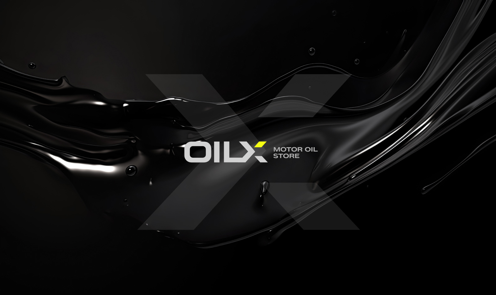
Oilx Motor Oils
Date: Jule 2023
Case Study: Oilx – Power in Every Drop
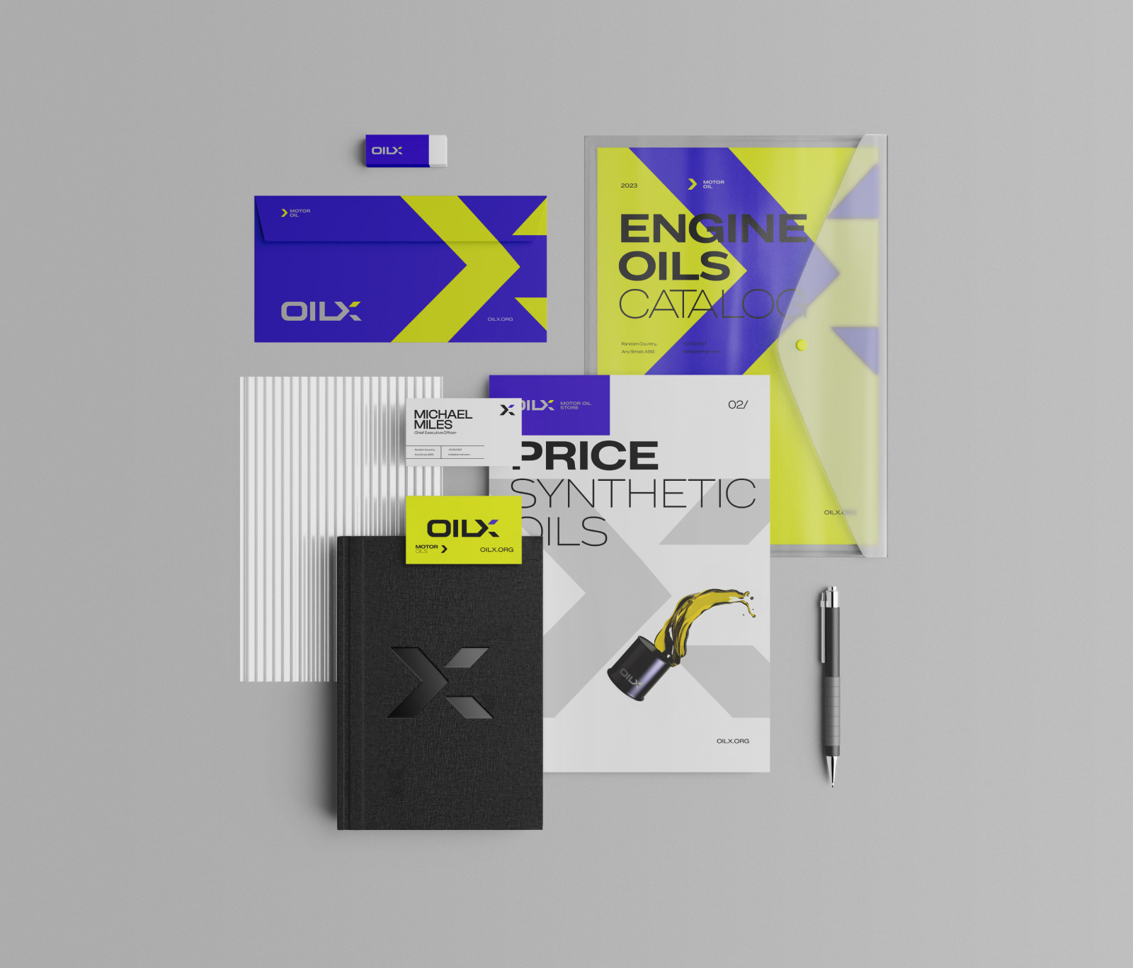
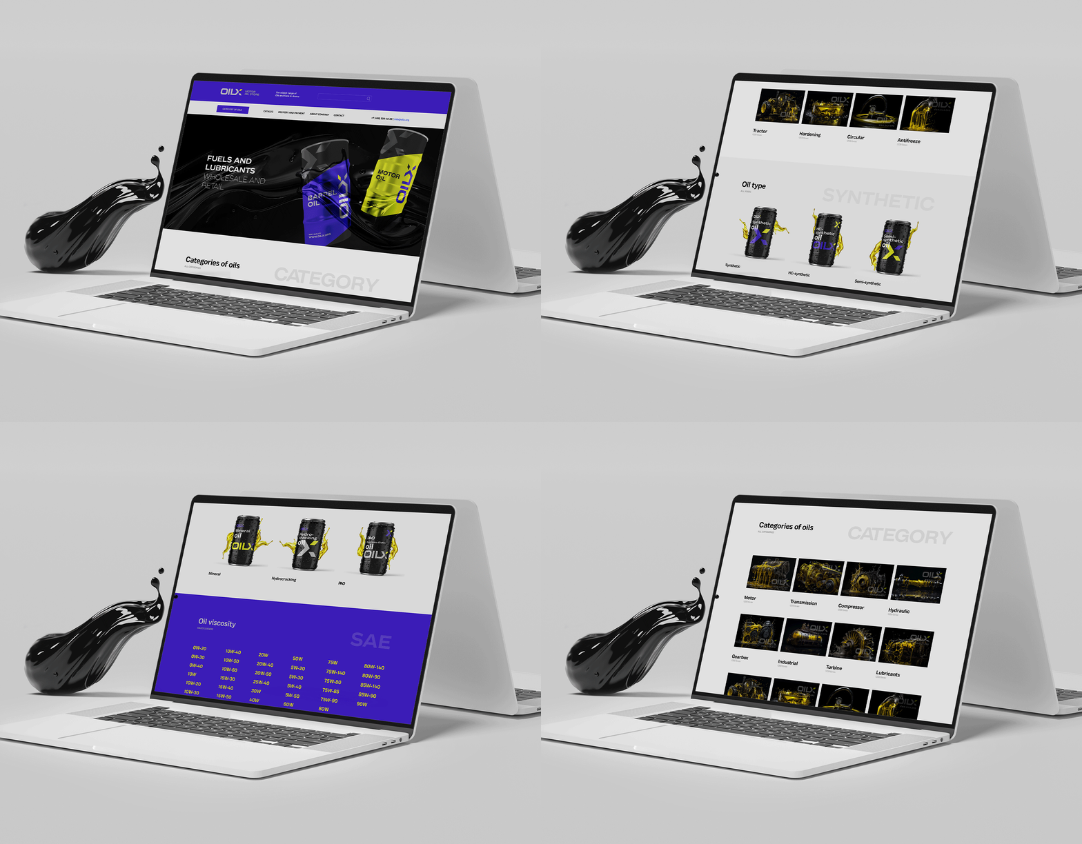
Challenge: Redefine Oilx, a motor oil company, with a dynamic logo, web design, brand graphics, and packaging. Inject vibrancy and a sense of automotive power.
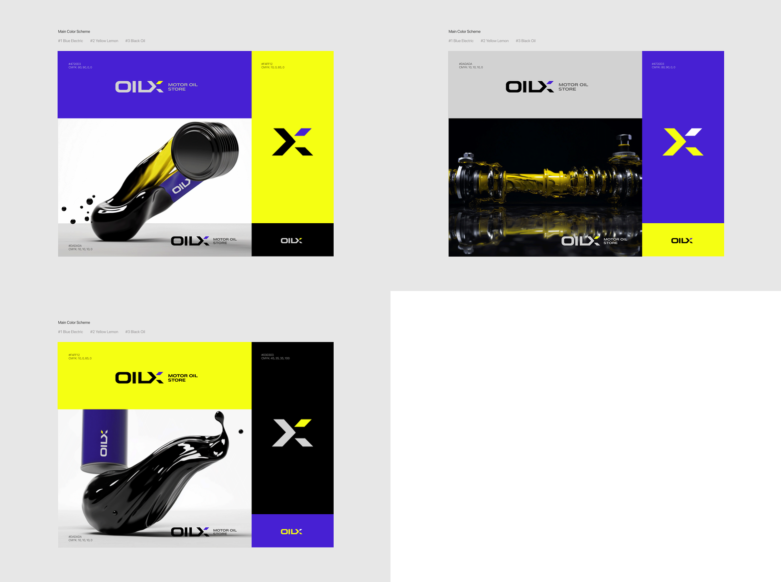
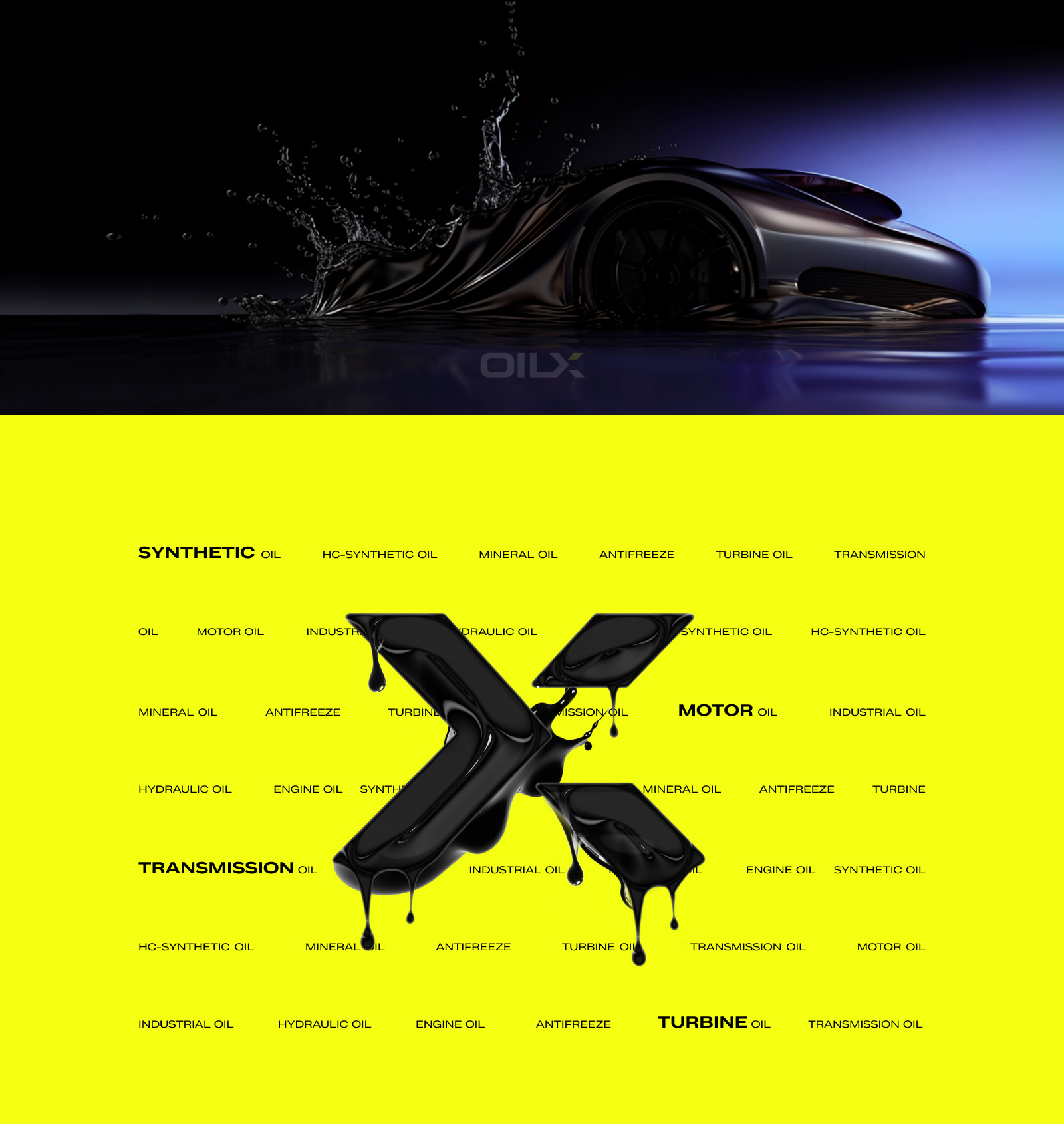
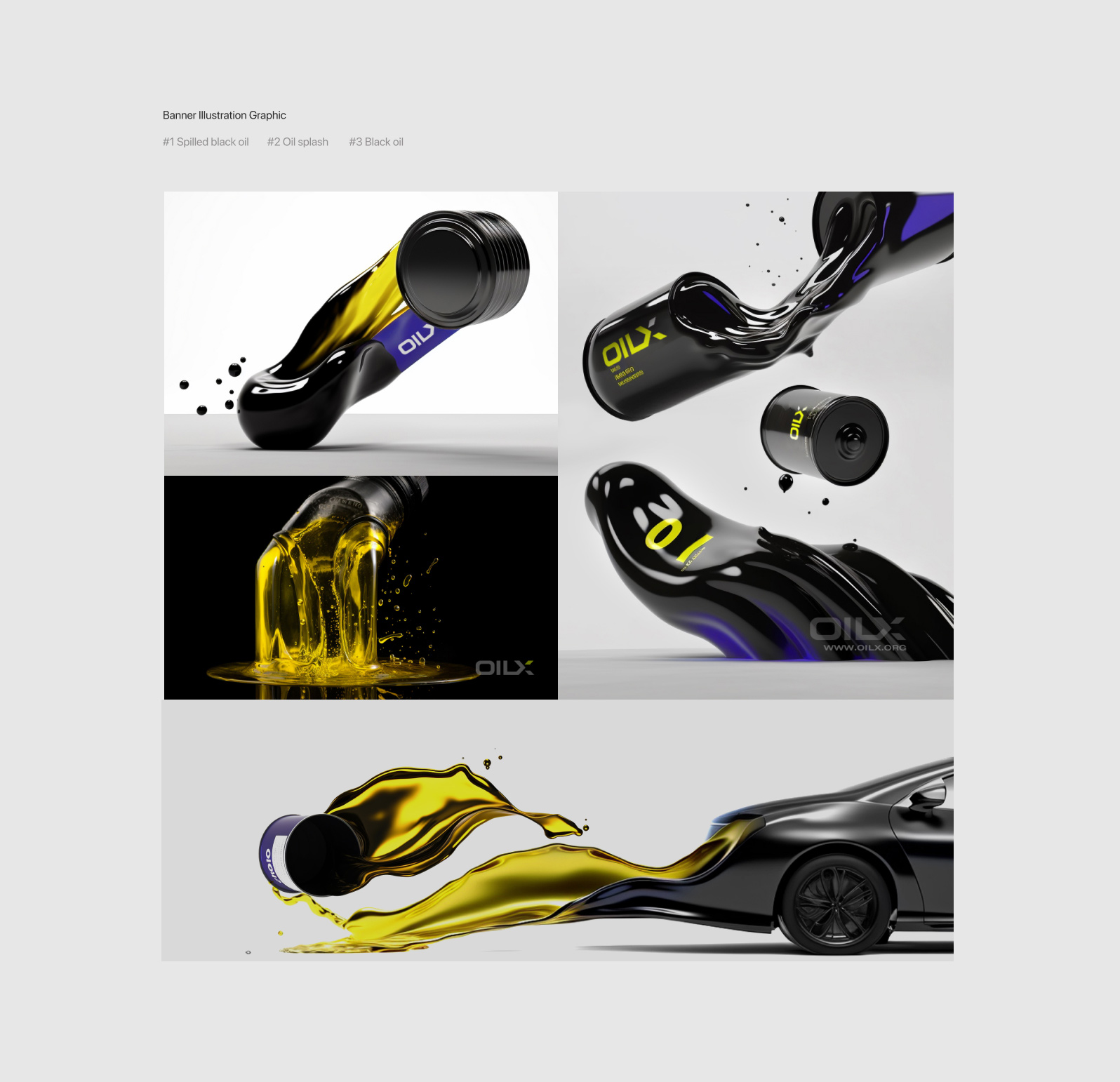
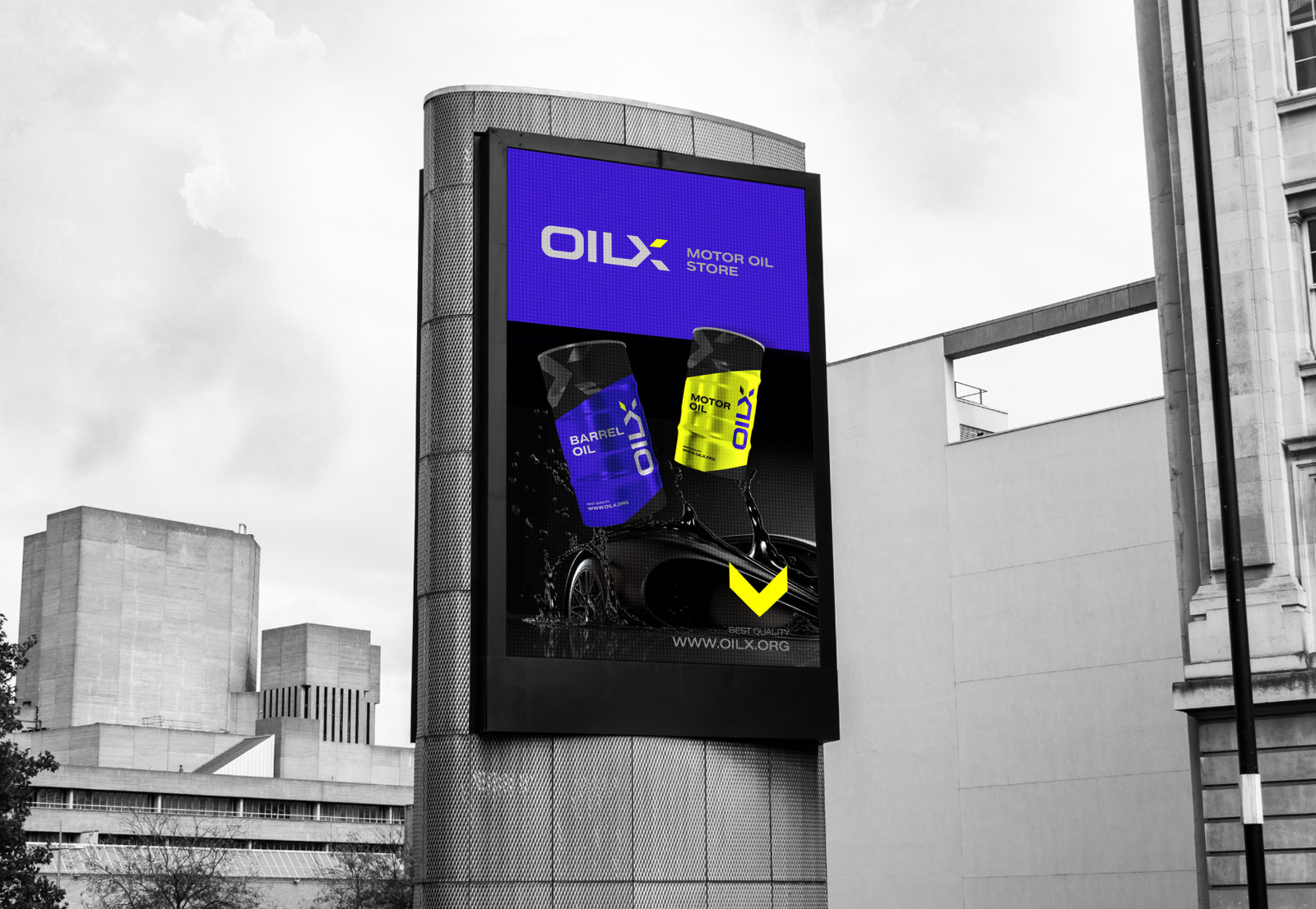
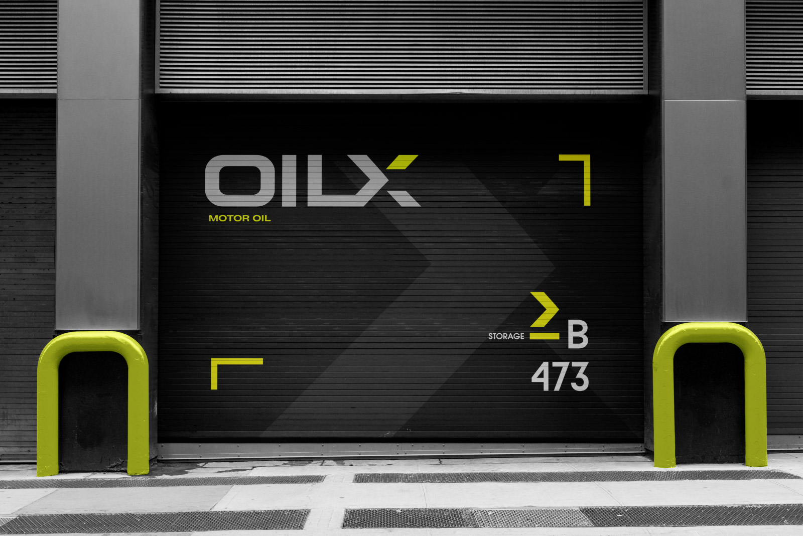
Approach: Crafted a striking logo typography in blue-violet electric, lemon yellow, and black. Illustrated brand graphics with black oil drops and splashes, seamlessly integrating automobiles flowing into the motor oil.
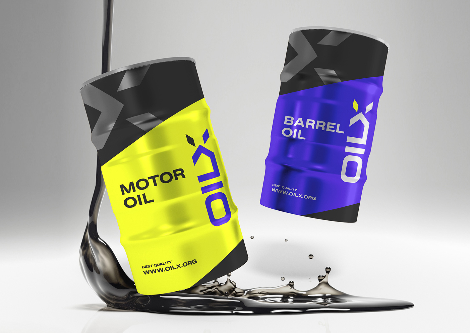
Result: A visually cohesive brand identity, from logo to web design and packaging, reflecting the synergy between automotive strength and the vital essence of motor oil.
Impact: Elevated brand recognition, increased web engagement, and a standout presence on the shelves. The design resonates with car enthusiasts and professionals alike.
Conclusion: Successfully fueled Oilx’s visual identity, portraying power, efficiency, and innovation across all touchpoints.


