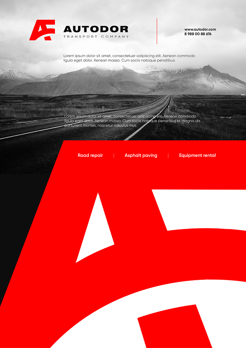
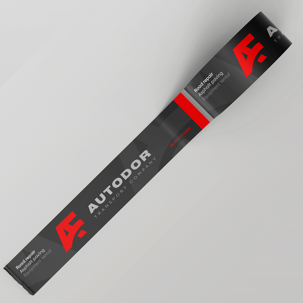
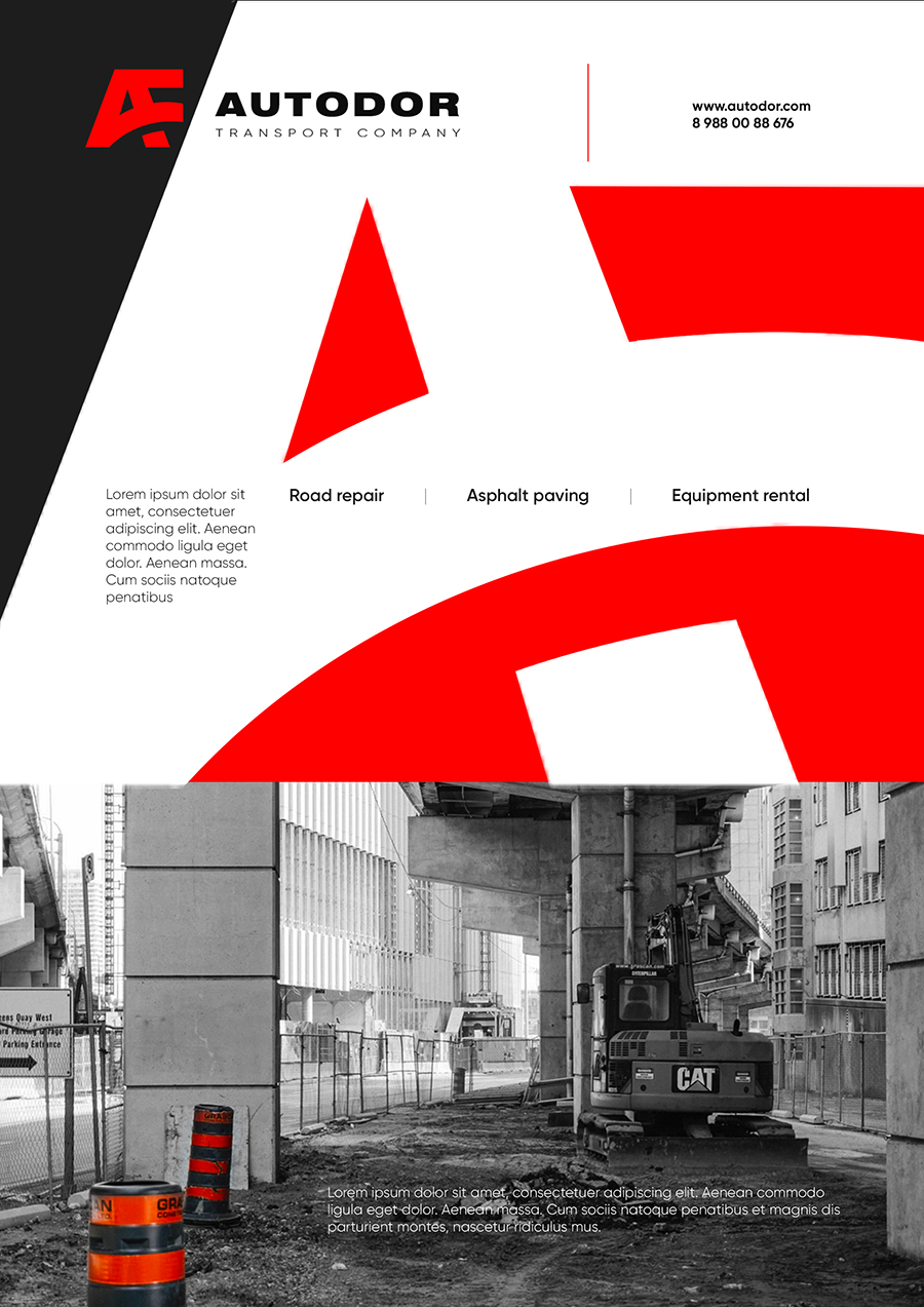
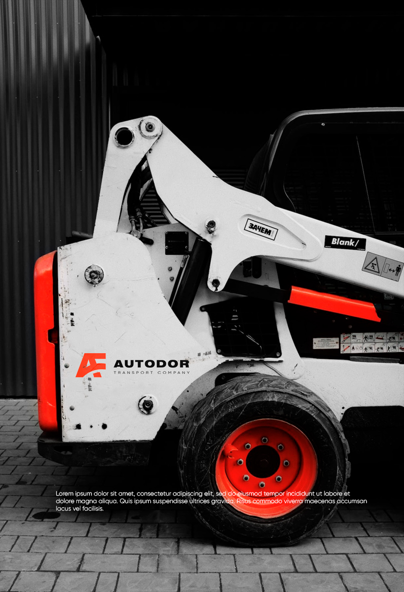
Autodor Transport Co


Date: May 2021
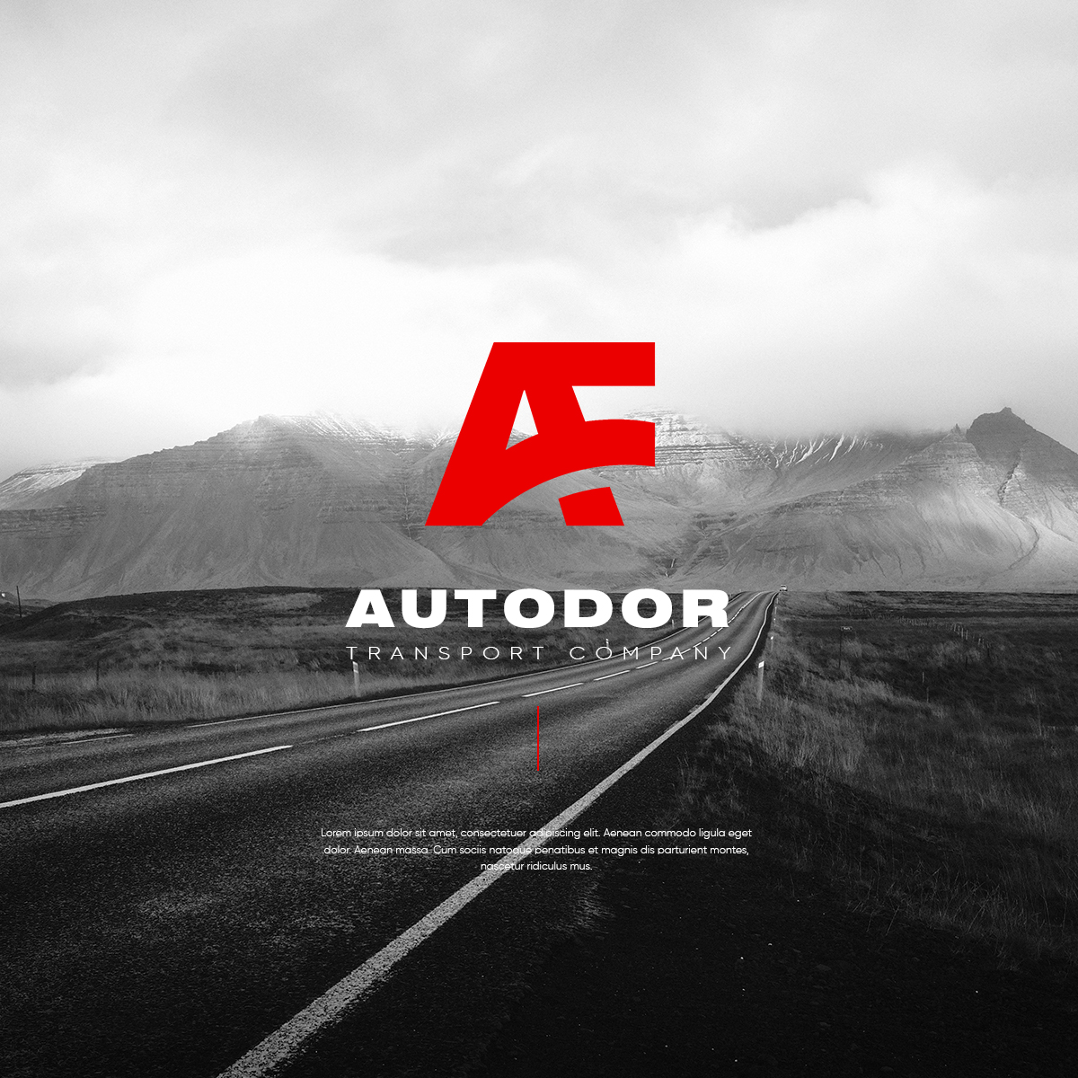
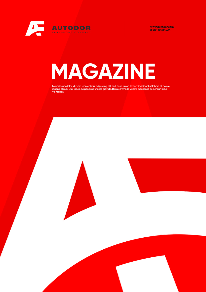
Case Study: Highway Company Rebrand
Challenge: Revamp the identity of a large highway company for a modern and dynamic image.
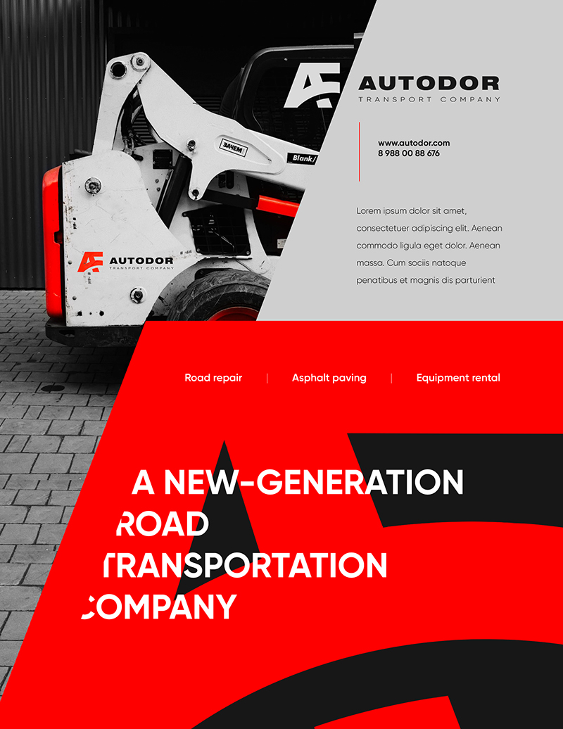
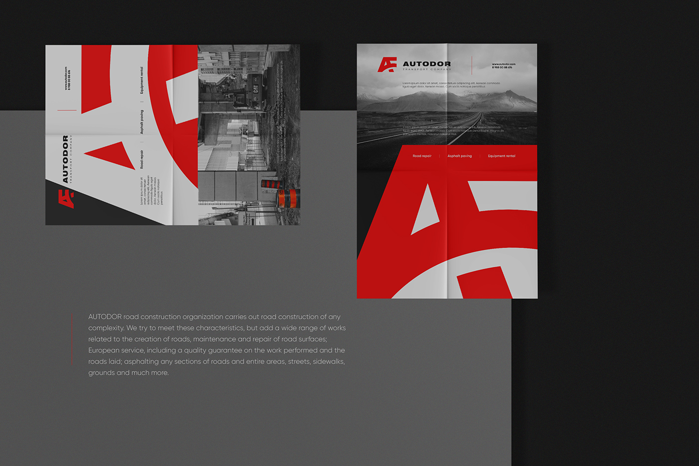
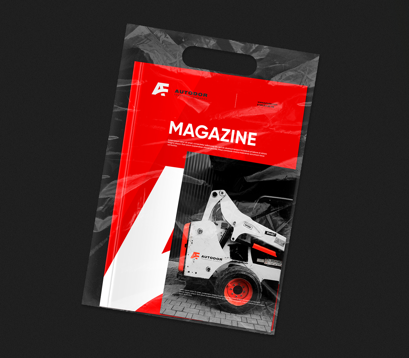
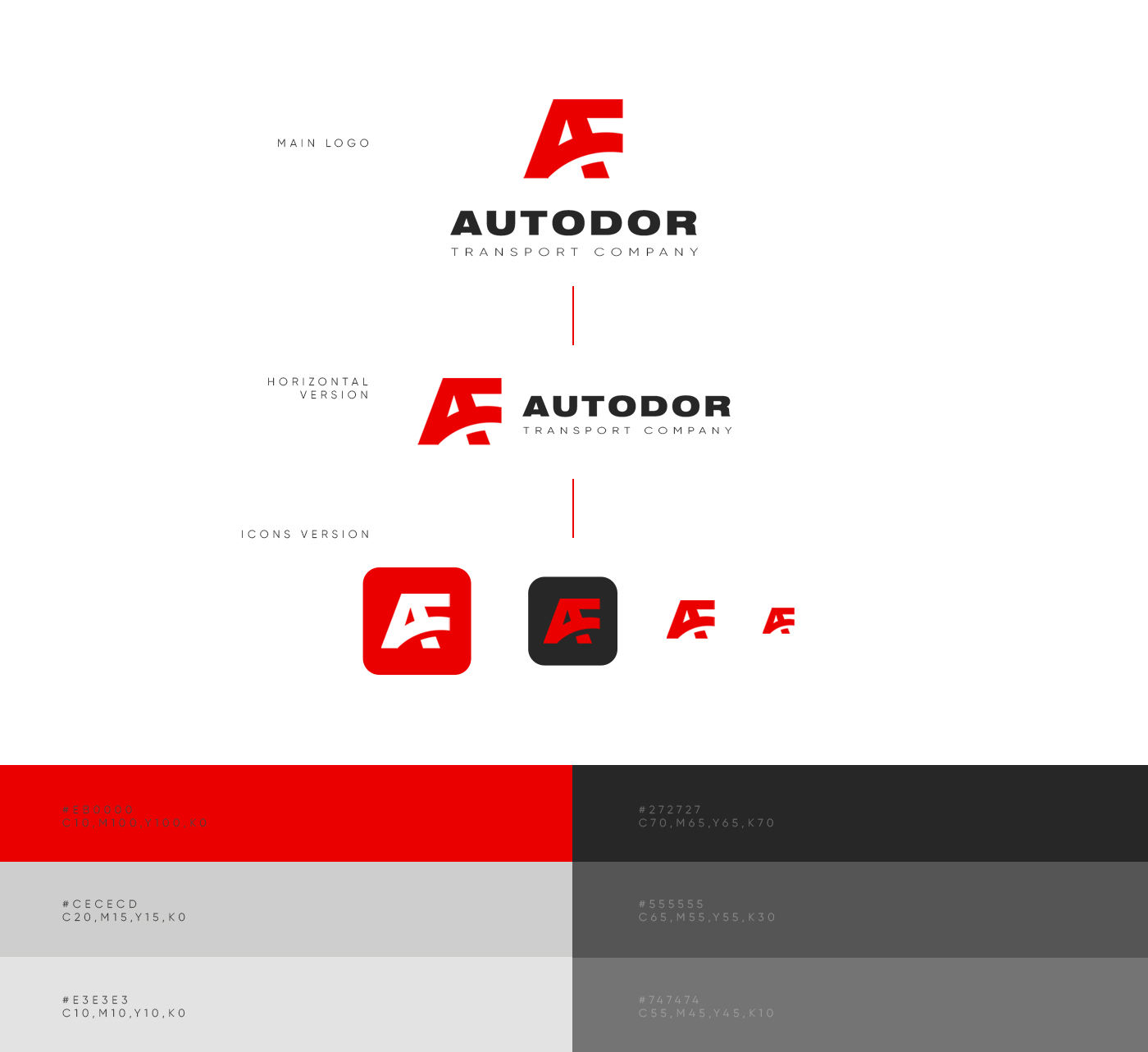
Approach: Developed a bold logo and corporate identity using a vibrant red paired with dark gray. The design reflects the company’s scale, energy, and reliability.
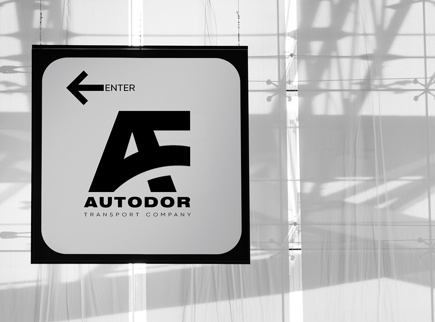
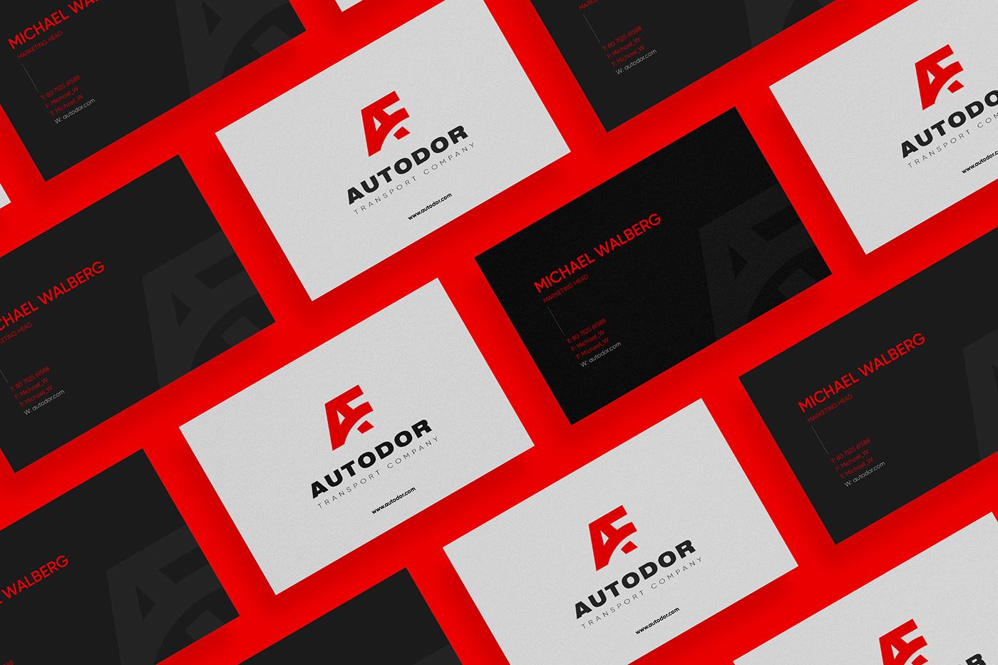
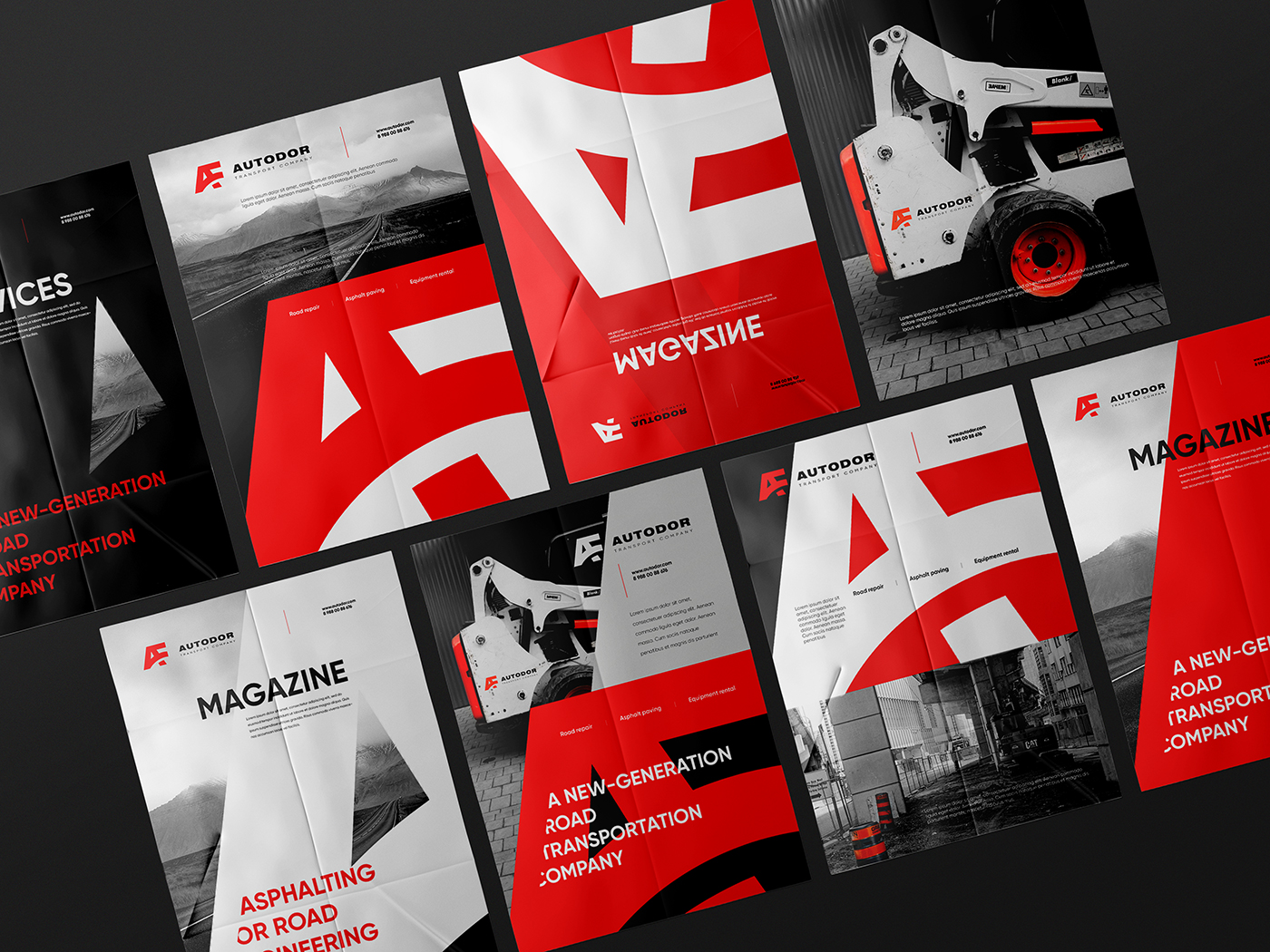
Result: A striking visual identity that communicates strength and professionalism, aligning seamlessly with the company’s stature.
Impact: Enhanced brand visibility, fostering a sense of trust among stakeholders. The rebrand positions the company as a leader in the industry.
Conclusion: Successful transformation, reinforcing the company’s identity on the road to success.
Together, we redefine the landscape of road transport, forging lasting relationships and embarking on a journey towards a brighter future.