Roadfox Logistic Co
Date: Dec. 2020
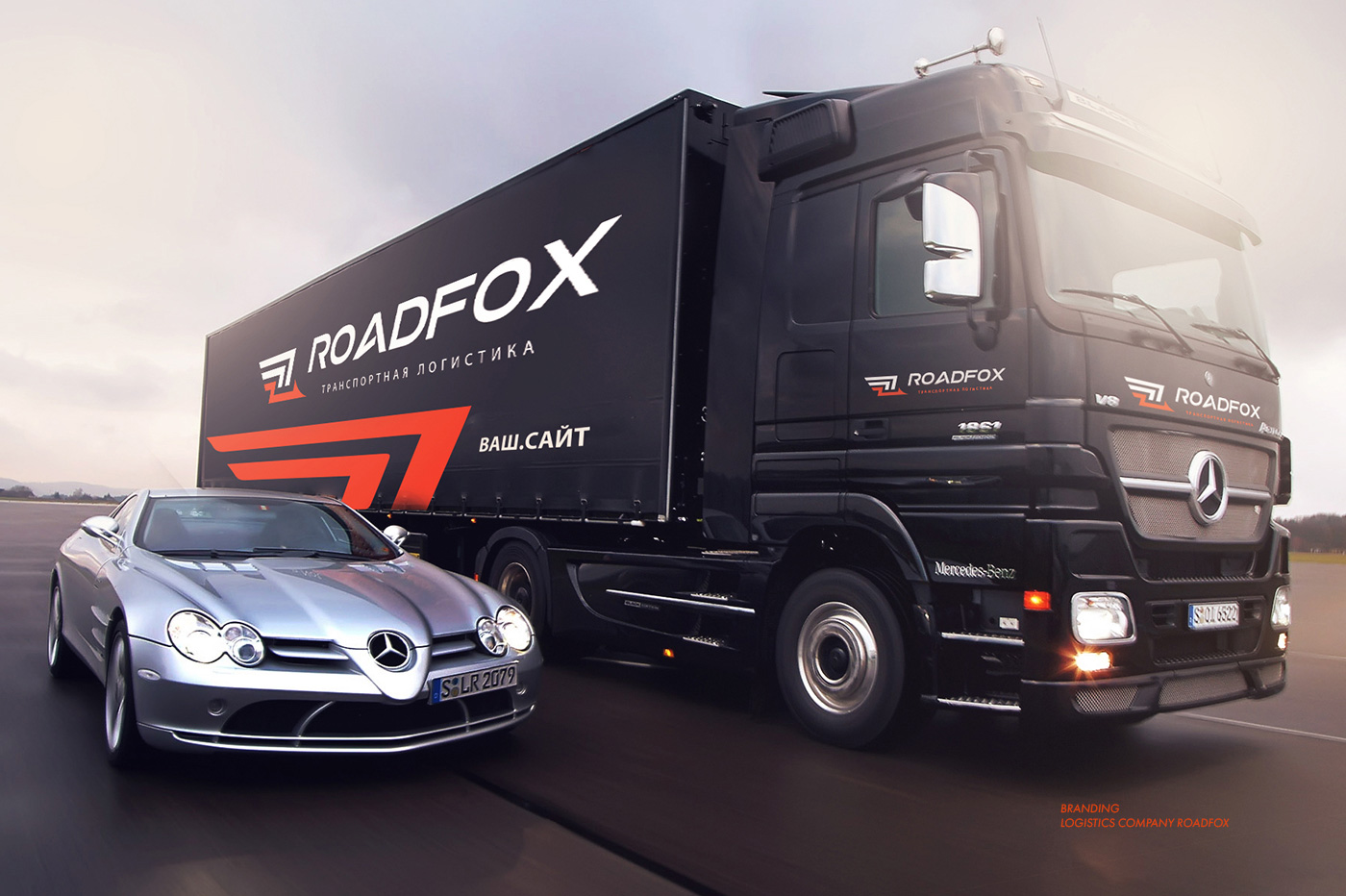
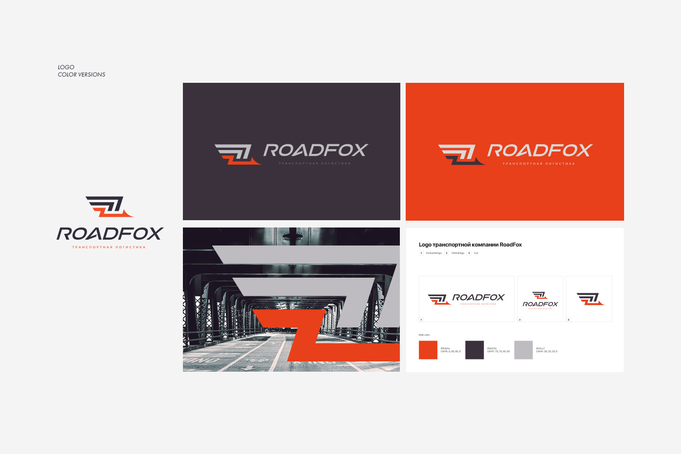
Case Study: RoadFox Logistics Roars to Life
Challenge: Create a dynamic identity for RoadFox Logistics, emphasizing agility and efficiency.
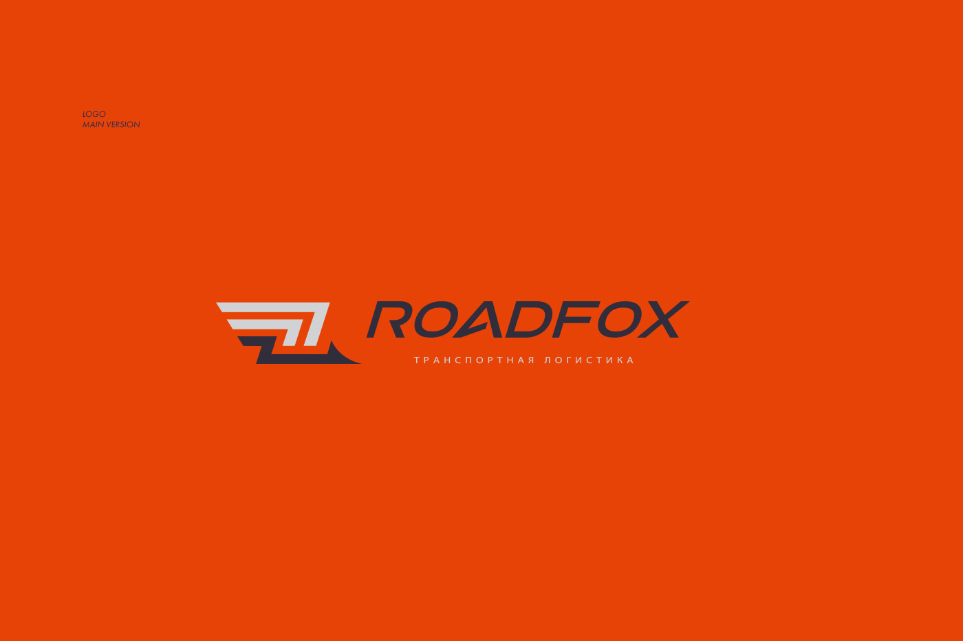
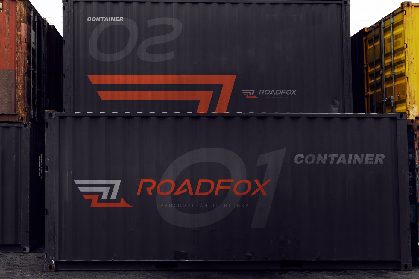
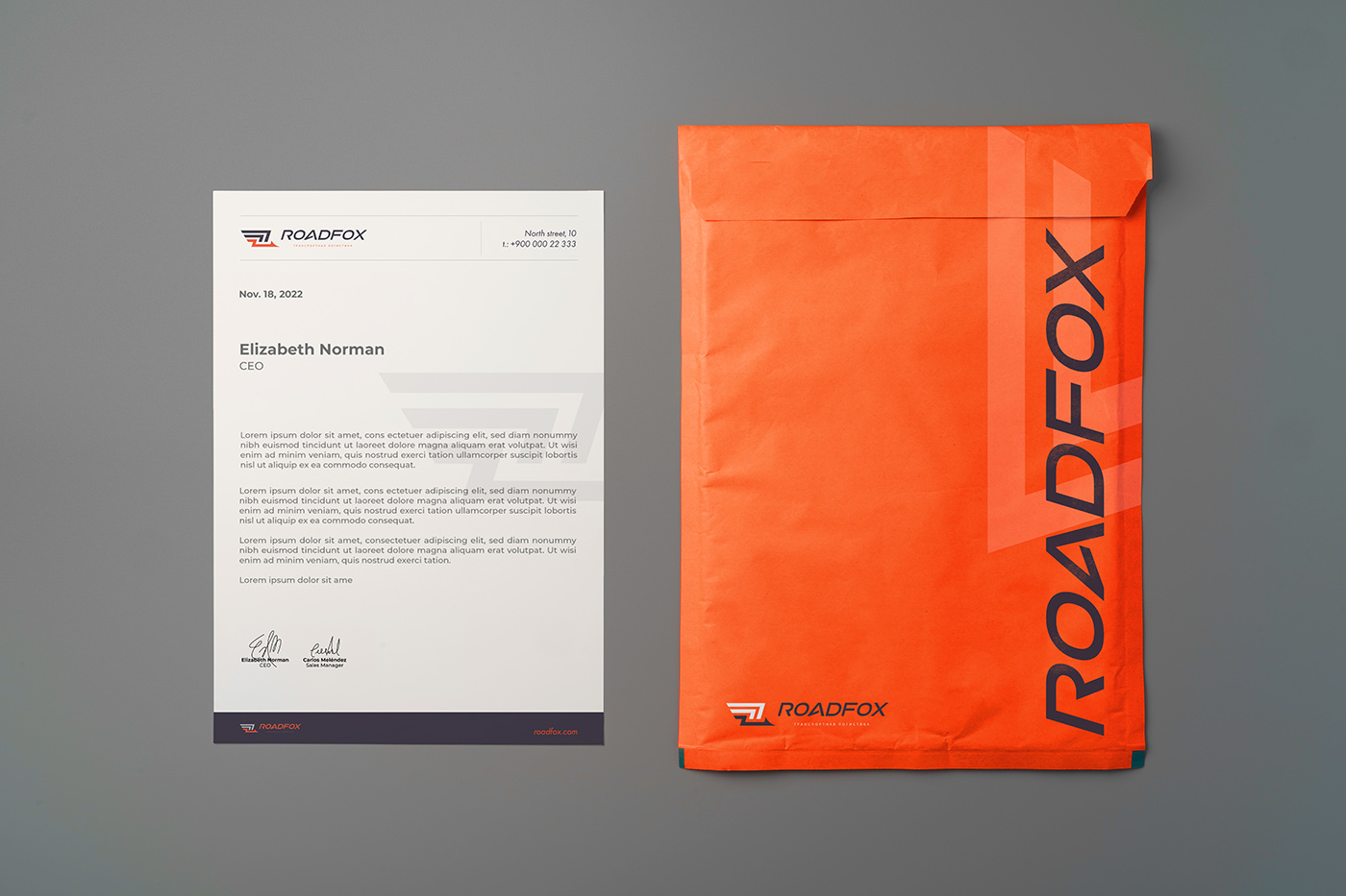
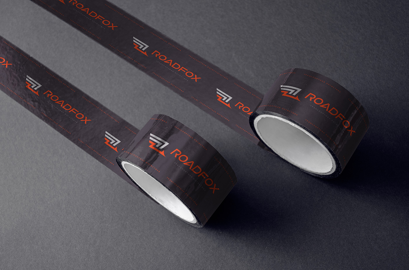
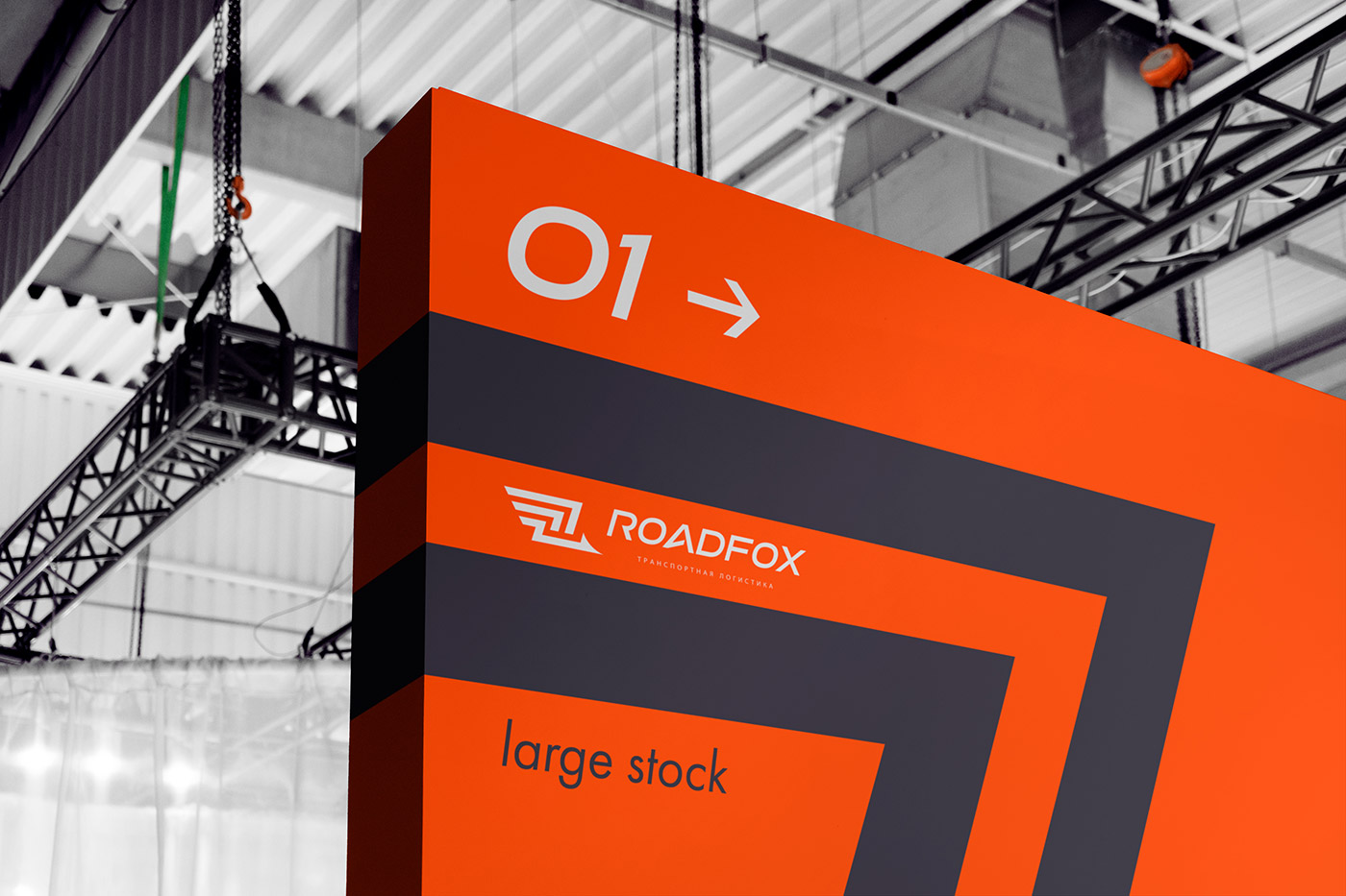
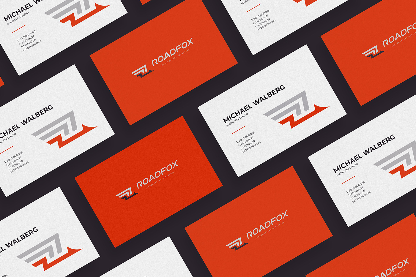
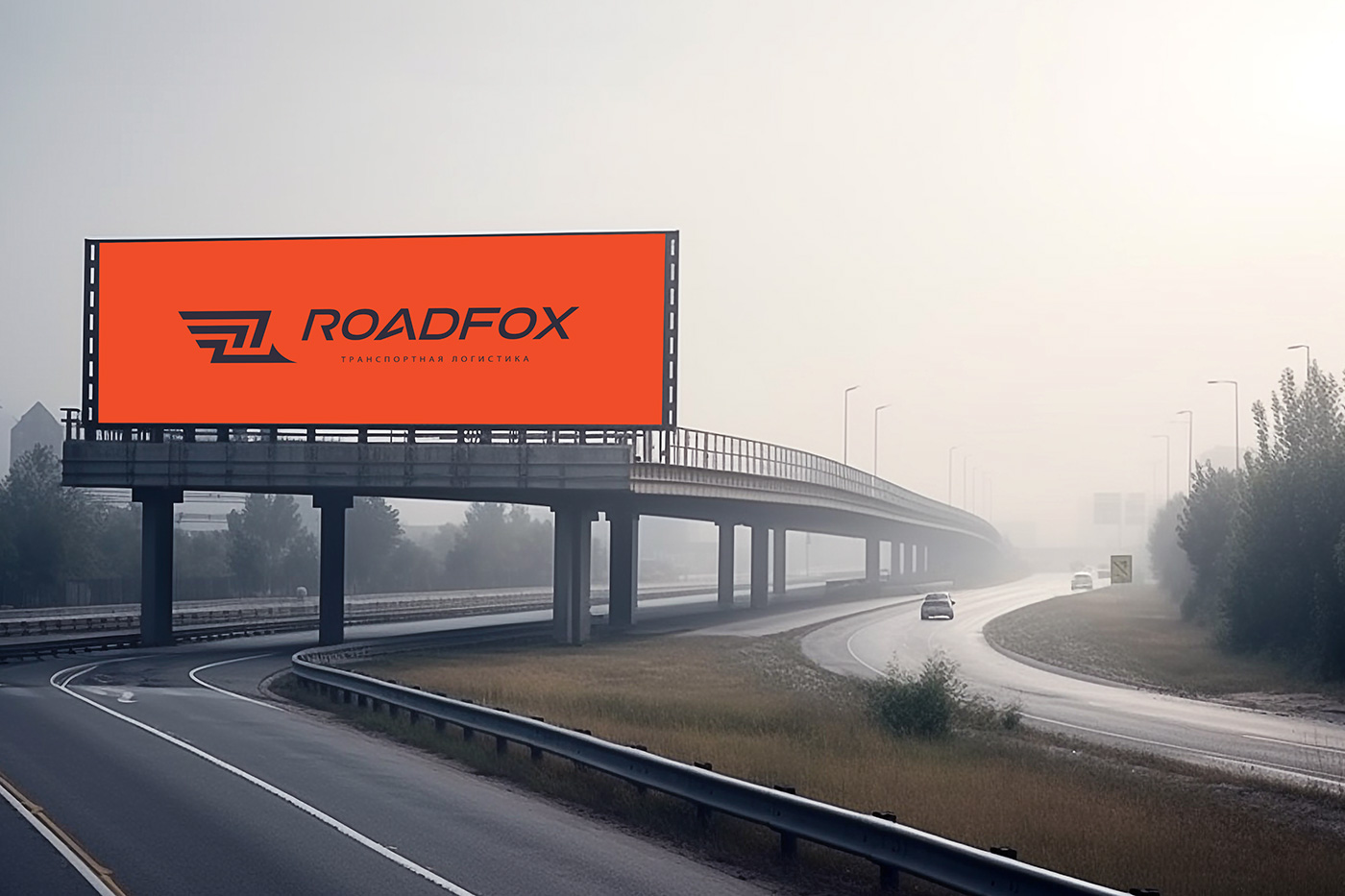
Approach: Fused bright orange and deep purple, symbolizing energy and reliability. The logo, with road-inspired lines and a fox silhouette, captures the essence of seamless logistics.
Result: A vibrant, memorable brand identity that conveys speed, precision, and the company’s cunning approach to transportation solutions.
Impact: Elevated brand visibility, increased client trust, and a distinctive market presence. The design resonates with the logistics industry.
Conclusion: Successfully mapped the journey for RoadFox Logistics, blending innovation and identity.
Together, we create a brand that resonates with clients, instilling confidence in their logistics journey and igniting a sense of excitement for the road ahead.