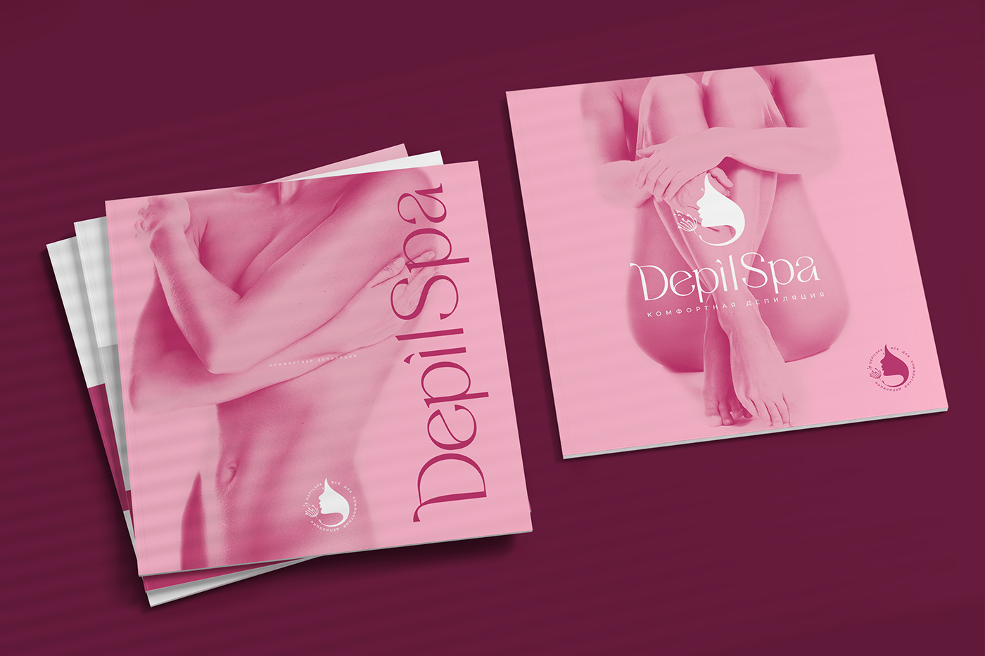
DepilSpa Wax Brand
Date: Feb. 2022
Case Study: DepilSpa Elegance Unveiled
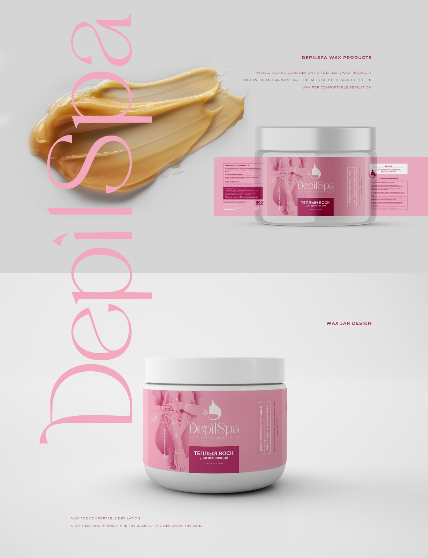
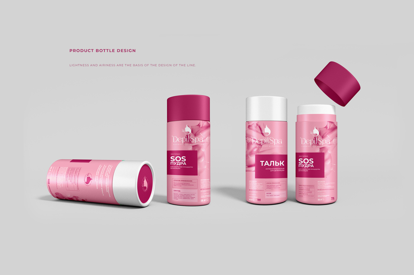
Challenge: Infuse a feminine aesthetic into DepilSpa’s depilatory wax line. Create a standout design reflecting beauty, spa luxury, and hair removal.
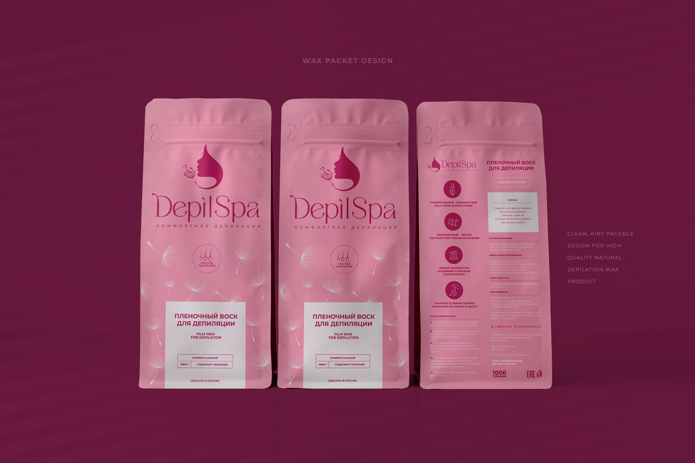
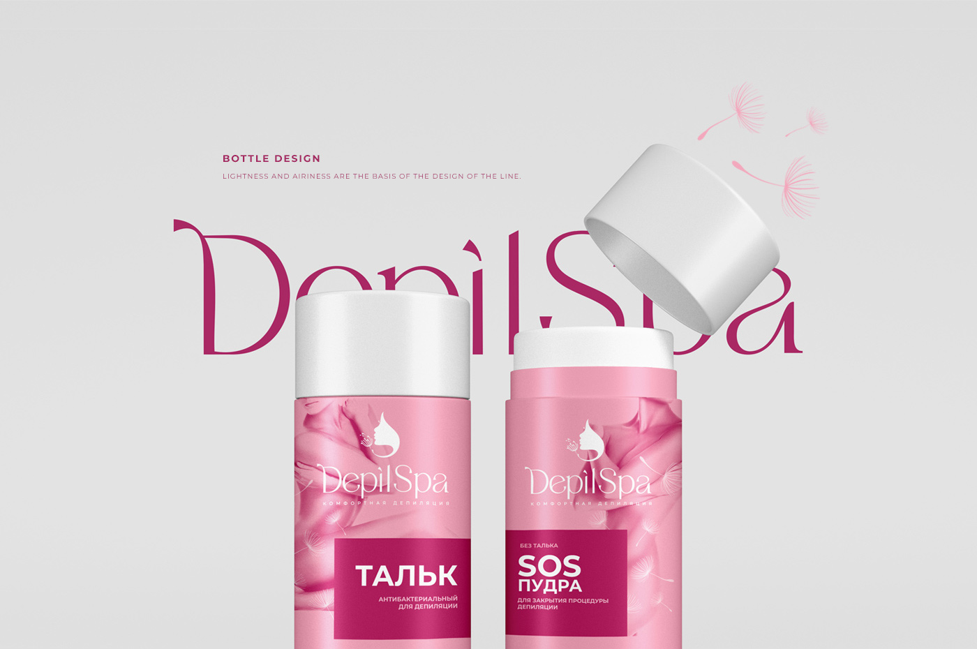
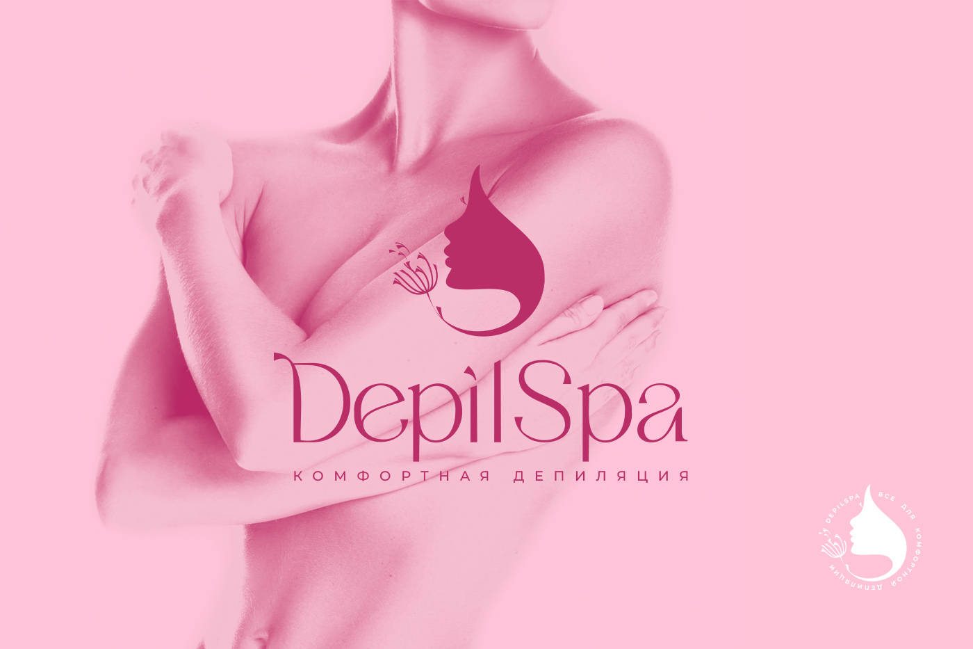
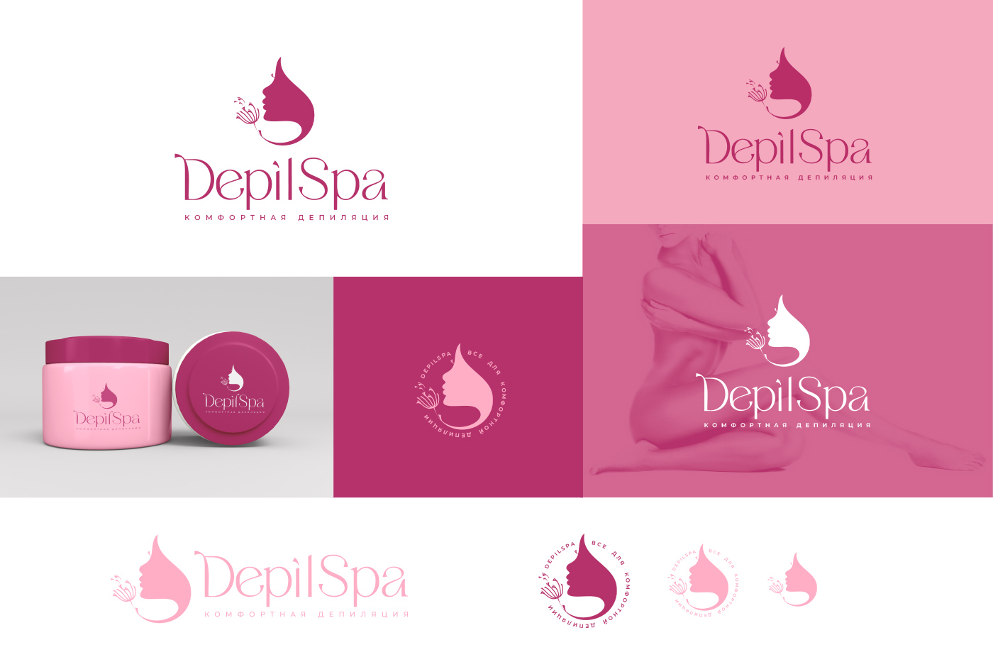
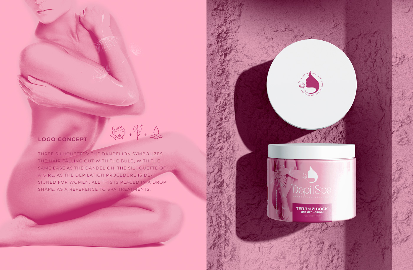
Approach: Crafted a logo in burgundy and powder pink, featuring a female face shaped like a drop, delicately blowing a dandelion. Symbolism: Womanhood, spa indulgence, and the promise of smooth skin.
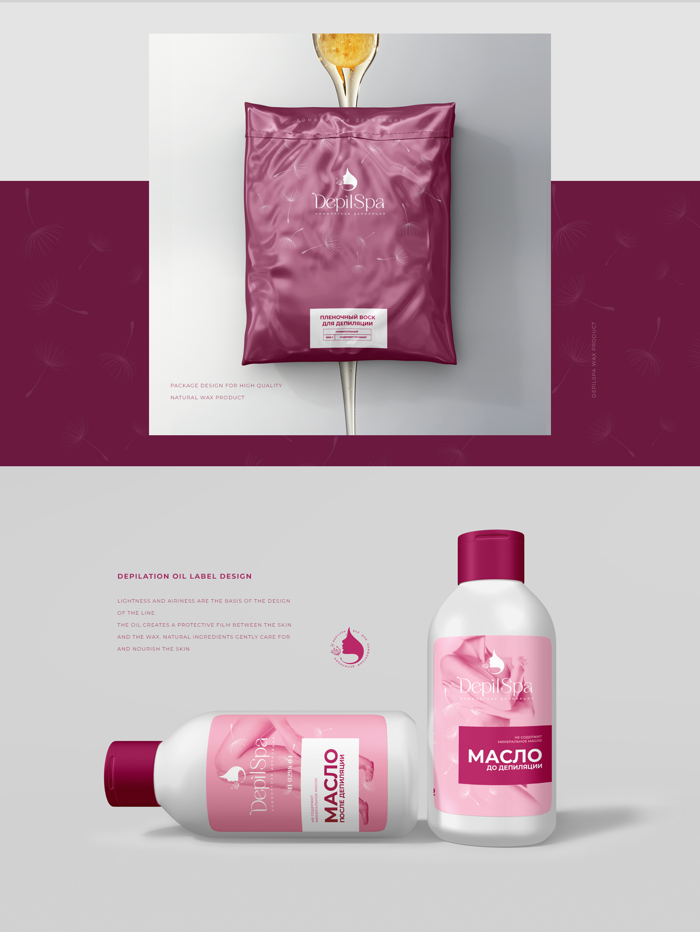
Result: A visually captivating logo and packaging that exudes grace, capturing attention on the shelves and resonating with the target audience.
Impact: Increased product visibility, enhanced brand recognition, and a distinct market presence. The design speaks to the essence of femininity and spa pampering.
Conclusion: Successfully transformed DepilSpa into a symbol of elegance, marrying functionality with beauty.

