Dragon Transit Service
Date: Jun. 2024
Case Study: Dragon Company – Unleashing Global transit.
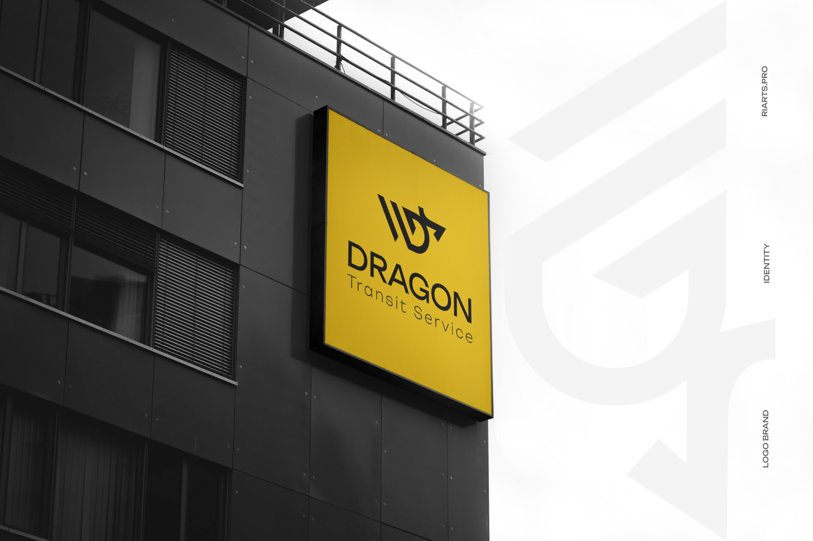
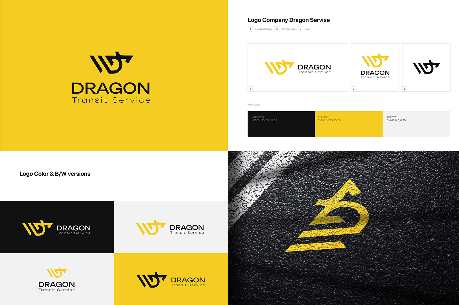
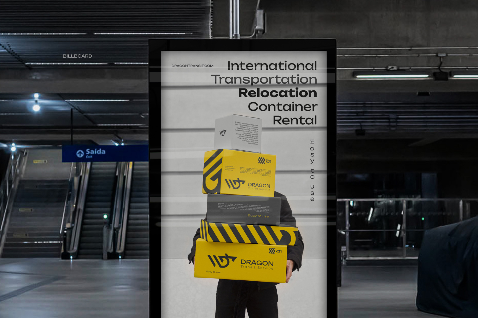
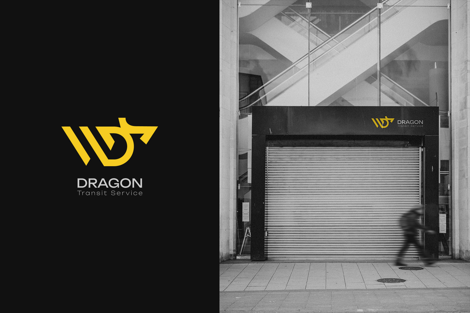
Challenge: Craft a logo and brand visualization for a transit and relocation powerhouse, Dragon Company. Merge the essence of a dragon with modern eclecticism, conveying global reach.
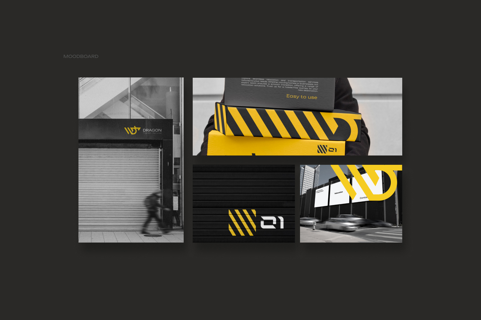
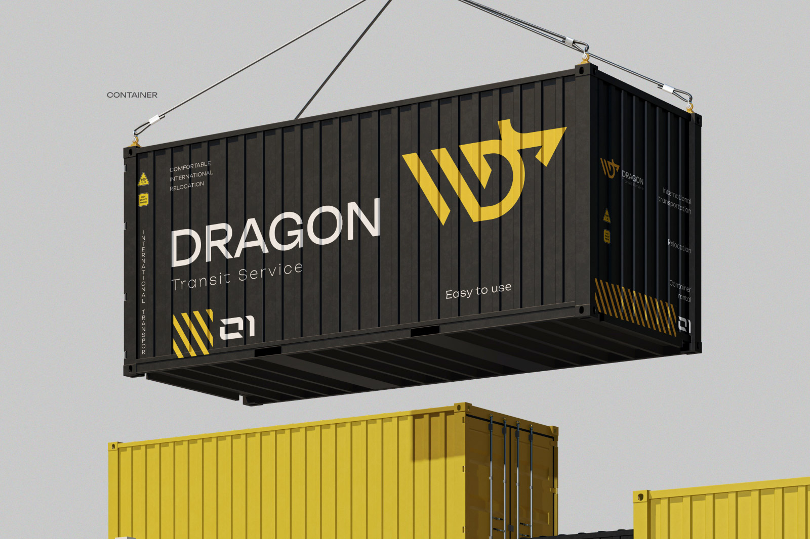
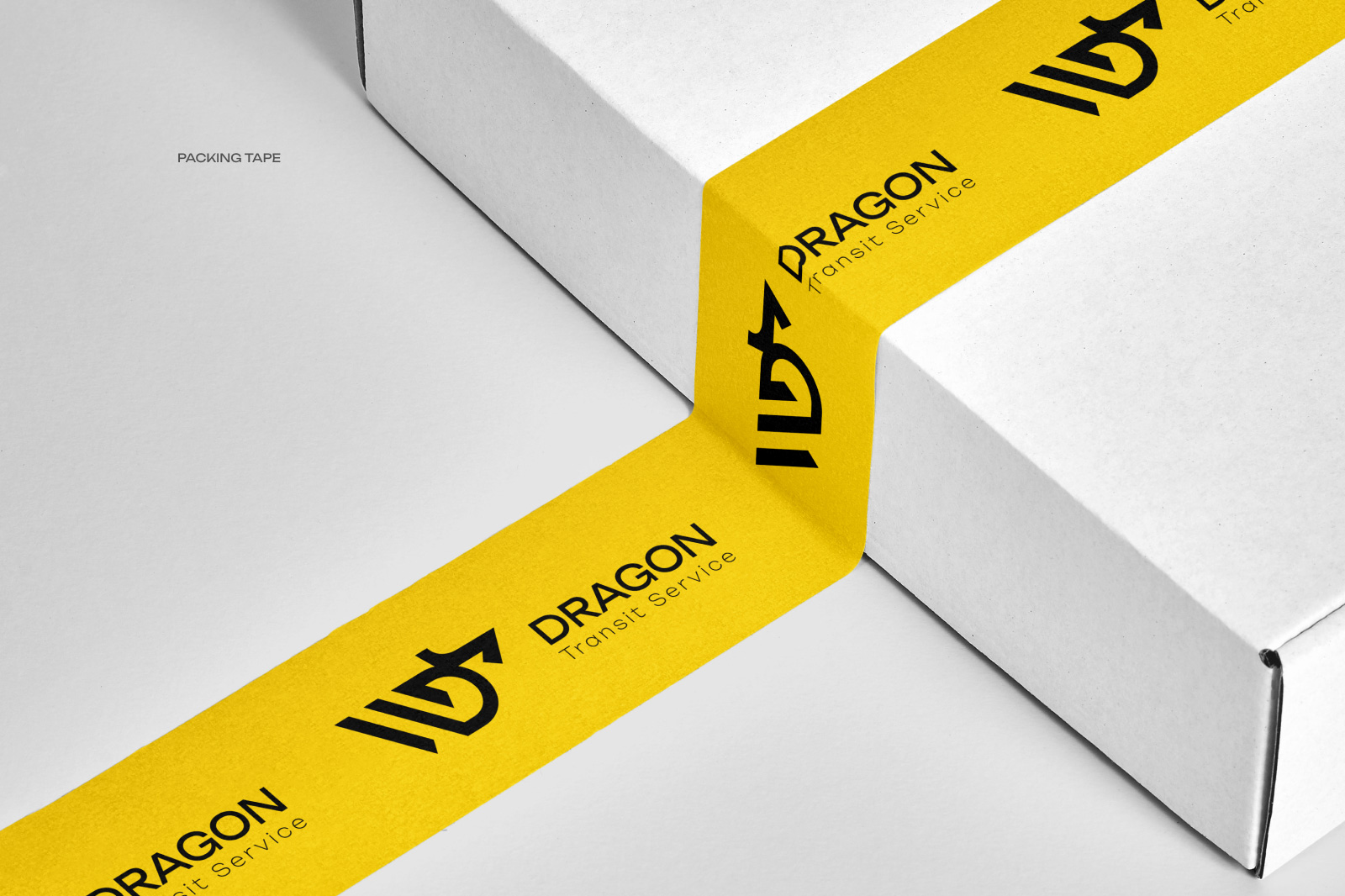
Approach: Utilized yellow and black for a bold palette. Merged a dragon silhouette, the letter D, and sleek stripes for a minimalist, eclectically modern logo. The clean lines represent precision in transit and relocation services.
Result: A visually captivating logo that seamlessly combines the mythical with contemporary design, reflecting Dragon Company’s commitment to global logistics.
Impact: Elevated brand visibility, increased client trust, and a distinct presence in the logistics industry. The minimalist design resonates with the company’s focus on efficiency and reliability.
Conclusion: Successfully unleashed the power of Dragon Company’s identity through a modern, minimalist logo, symbolizing global transit excellence.