Astorium Distribution Company
Date: Oct. 2023
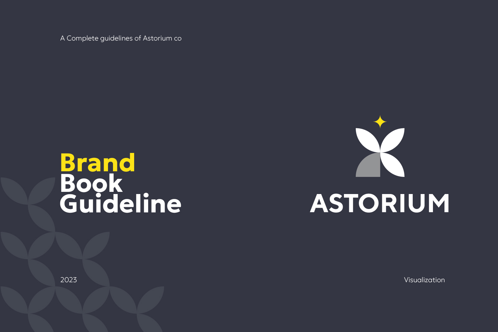
Case Study: Astorium – Nurturing Growth and Brilliance
Challenge: Develop a brandbook and guide for Astorium, symbolizing growth and prosperity in the B2B landscape.
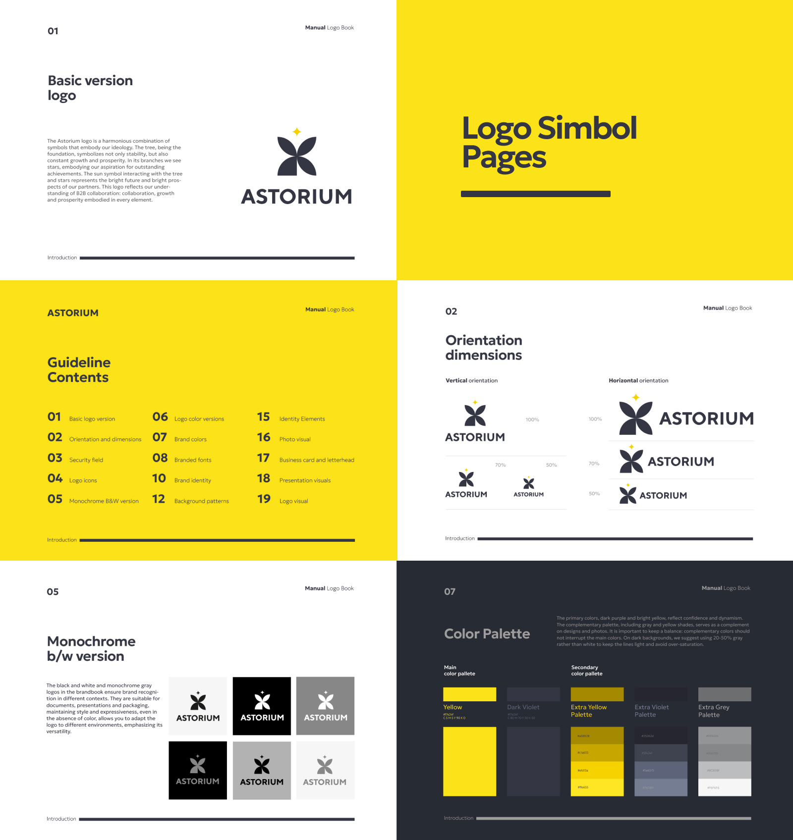
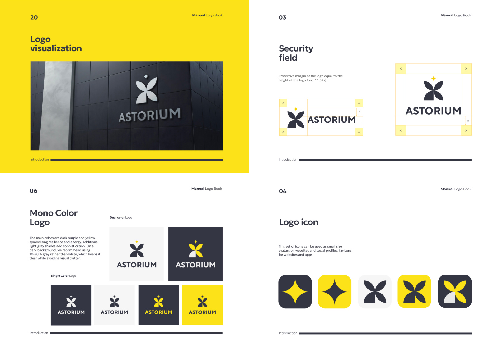
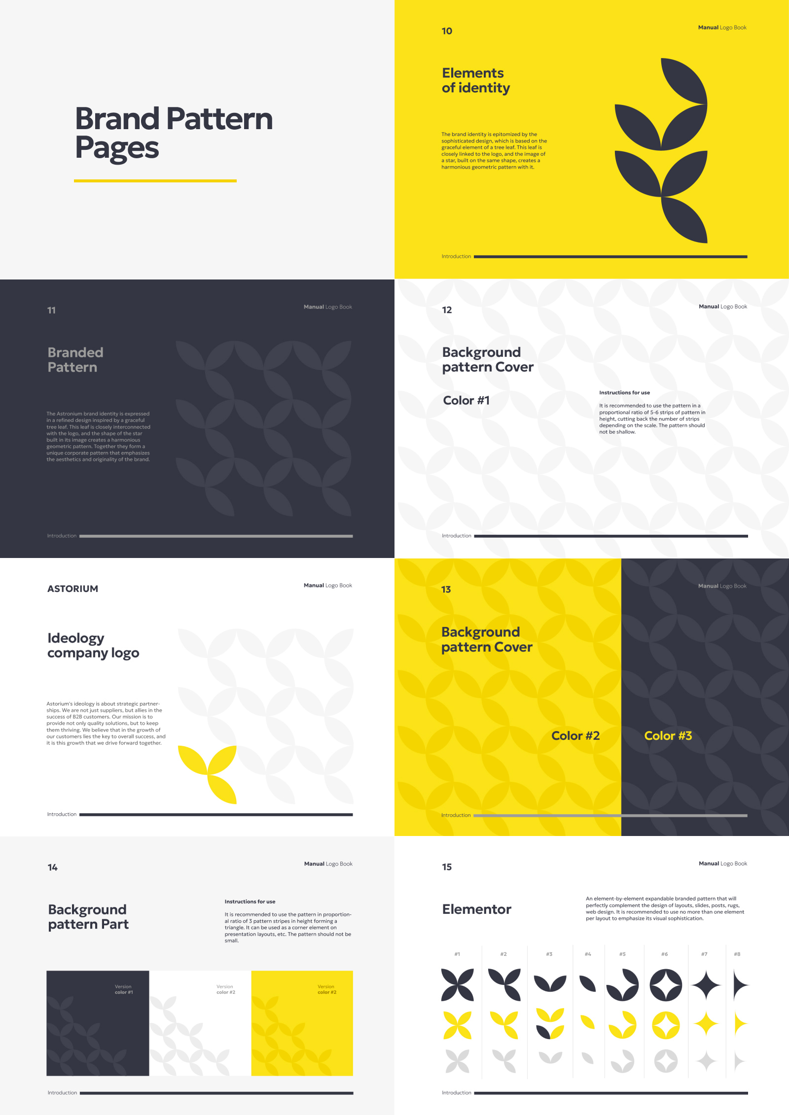
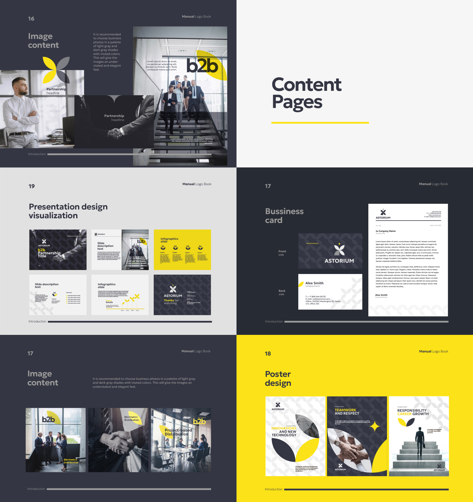
Approach: Crafted a logo with a harmonious blend of symbols: a tree representing stability and continuous growth, stars embodying aspirations for excellence. The brandbook features bright yellow and dark purple hues, emphasizing vibrancy and sophistication.
Result: An exquisite brand identity intertwining a leaf element and a star, creating a geometric pattern. This elegant design encapsulates collaboration, growth, and prosperity, reflecting Astorium’s commitment to B2B success.
Impact: Enhanced brand recognition, strengthened B2B relationships, and a visual language resonating with the ethos of collaboration and achievement.
Conclusion: Successfully translated Astorium’s ideology into a comprehensive brandbook and guide, fostering a visual identity that mirrors the essence of growth and excellence.