Unbending Menswear Brand

Date: Jan. 2022
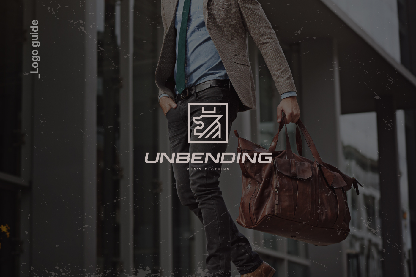
Case Study: Unbending – Embracing Masculine Strength.
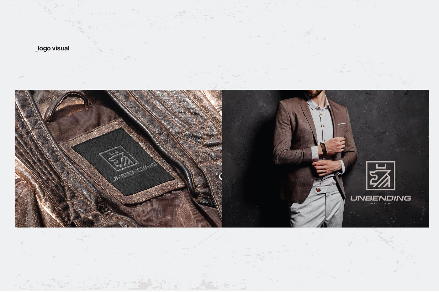
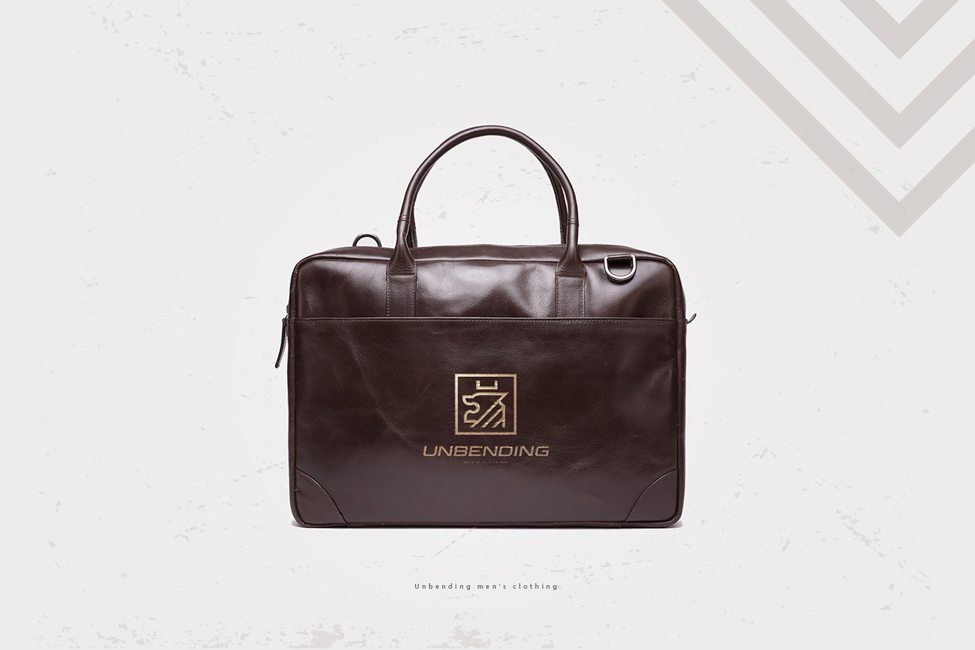
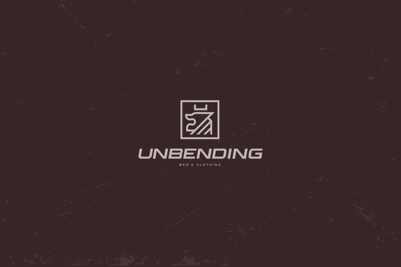
Challenge: Develop a logo and brand style for Unbending, a menswear brand, that embodies strength and masculinity. Incorporate a sketched silhouette of a lion to convey indomitability and power. Utilize a natural font and a color scheme of brown and beige to evoke a casual yet refined style.
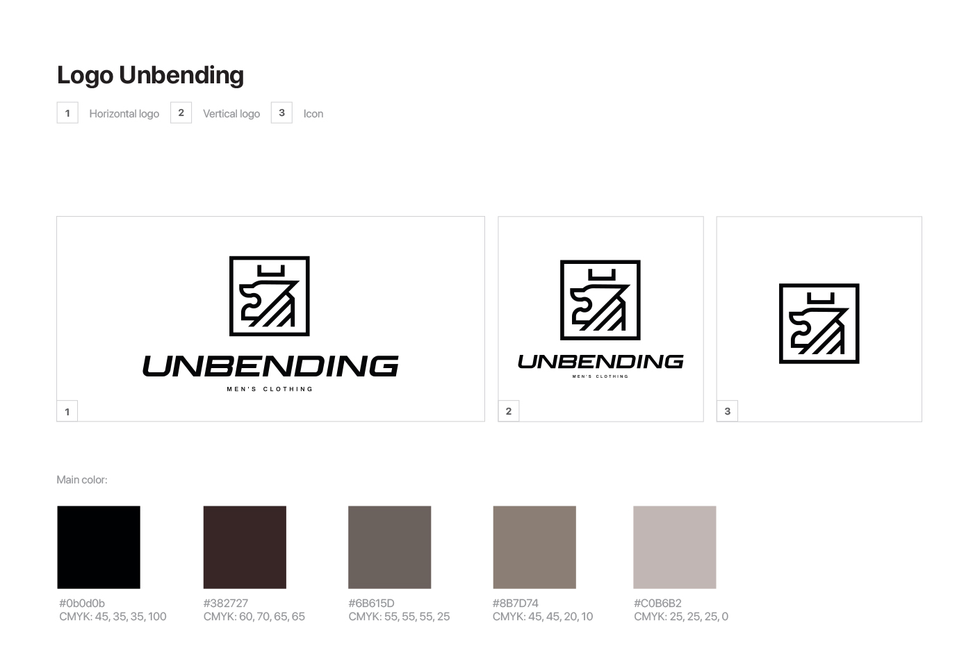
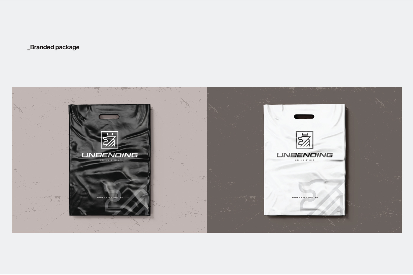
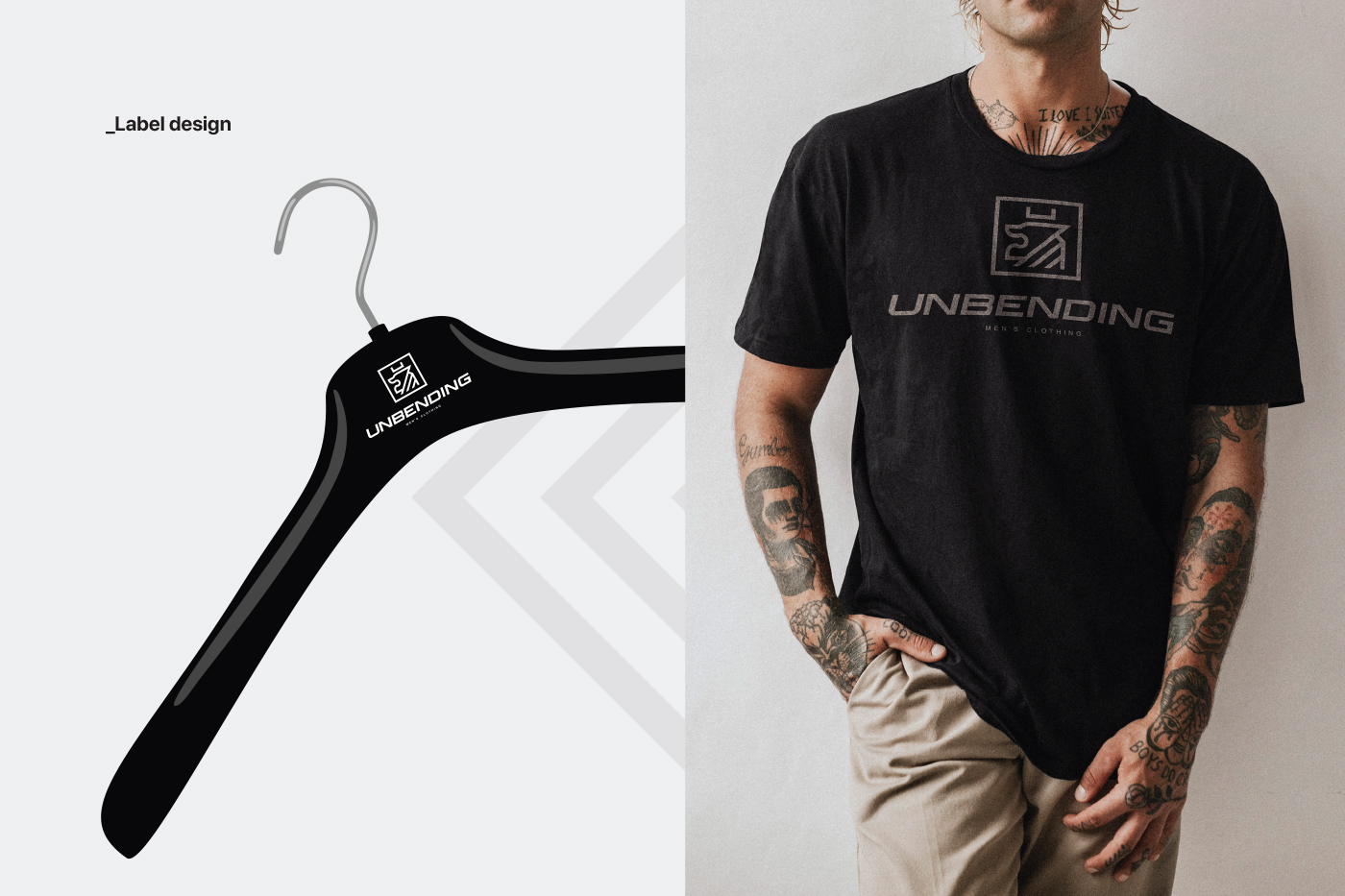
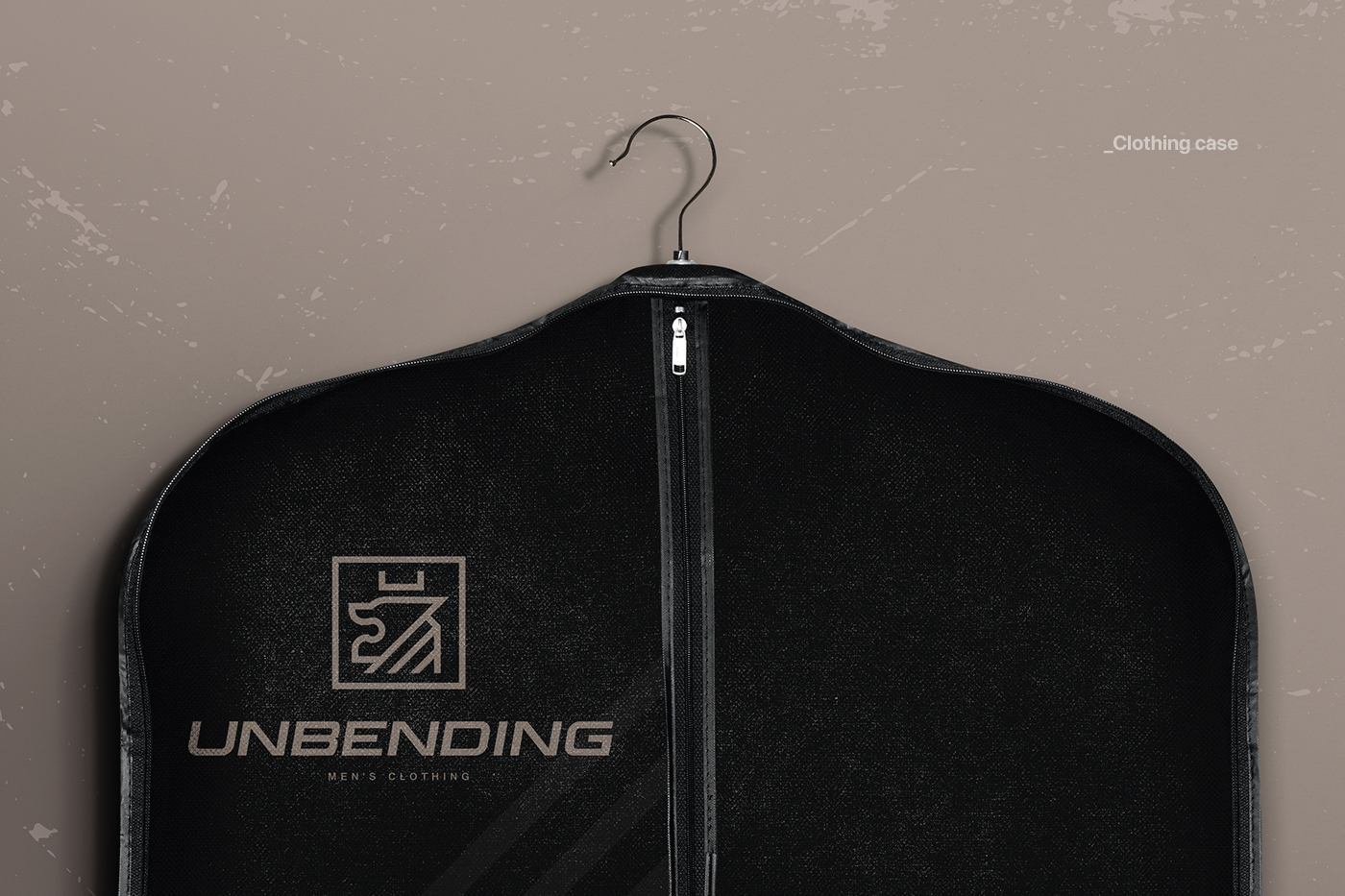
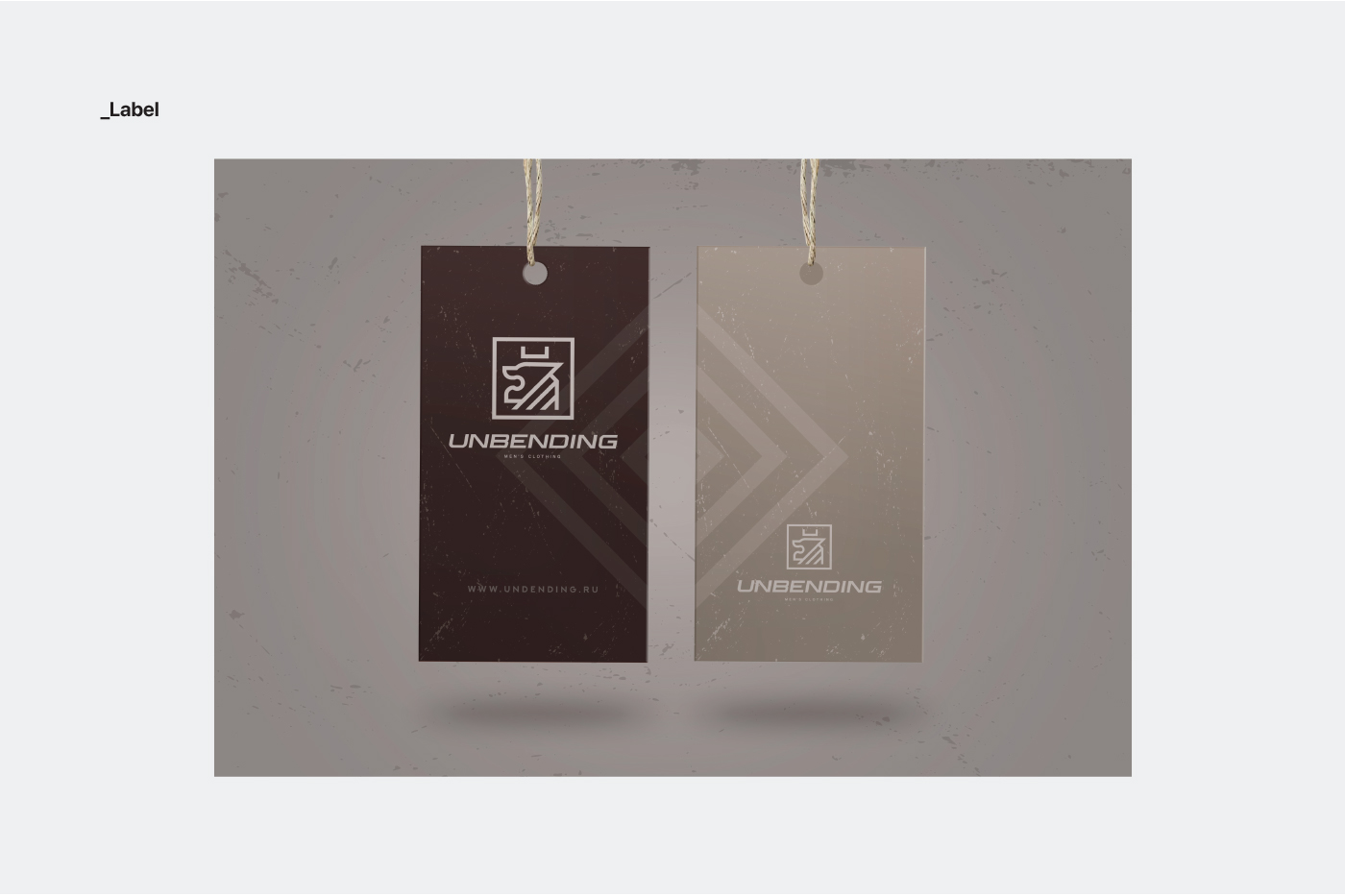
Approach: Crafted a logo featuring a sketched lion silhouette, symbolizing strength and resilience. Chose a natural font to convey authenticity and simplicity. Employed a color scheme of brown and beige to evoke warmth and sophistication, reflecting the brand’s casual yet refined aesthetic.
Result: A visually compelling logo and brand style that capture the essence of Unbending’s masculine identity. The sketched lion silhouette exudes strength, while the natural font and color scheme convey authenticity and refinement.
Impact: Increased brand recognition, heightened appeal among consumers seeking quality menswear, and a distinct presence in the competitive fashion market. The logo and brand style reinforce Unbending’s reputation as a purveyor of strong and stylish menswear.
Conclusion: Successfully established Unbending’s brand identity with a logo and style that embody masculine strength and sophistication, setting the brand apart in the menswear industry.