Metropolis Engineers

Date: Dec. 2021
Case Study: Metropolis Engineers – Shaping Tomorrow’s Structures .
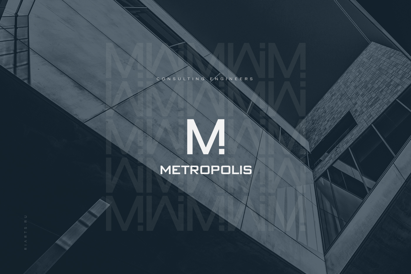
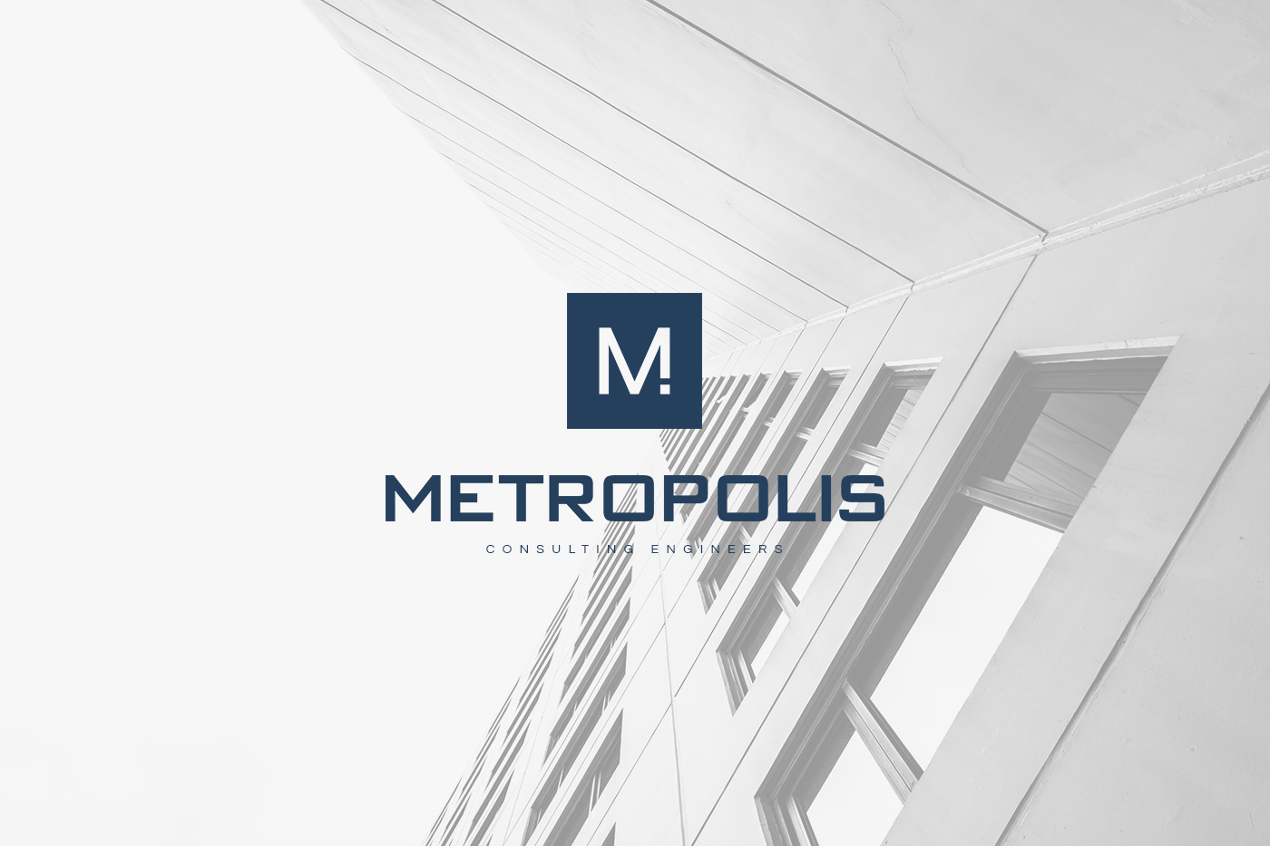
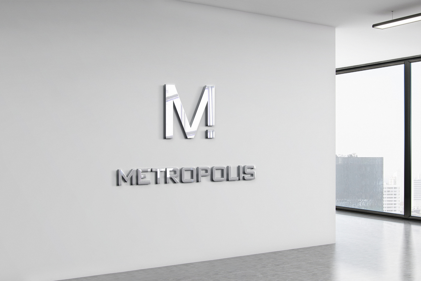
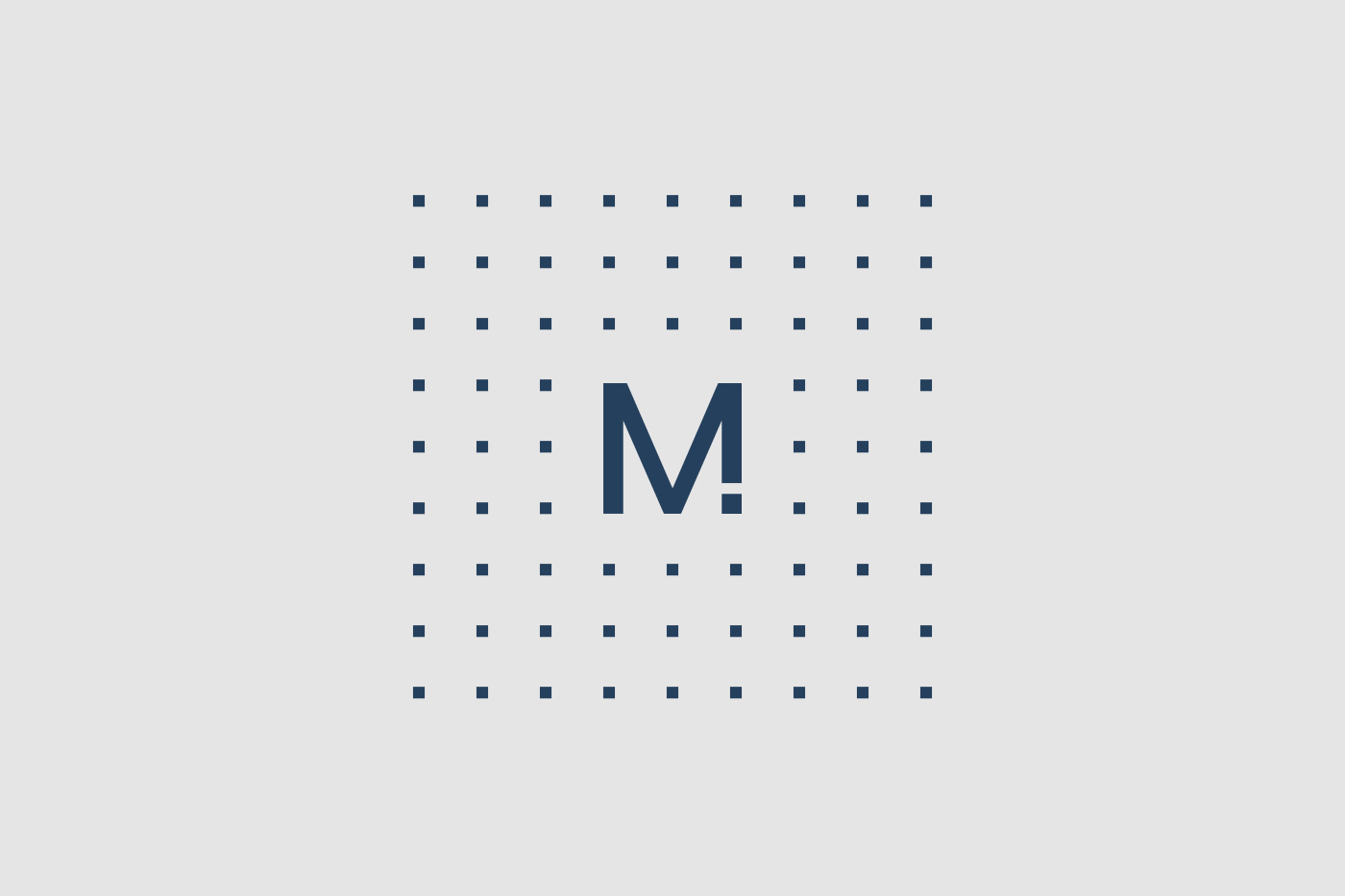
Challenge: Develop a logo and corporate identity for Metropolis Engineers, a building and engineering systems design company. Create a symbol incorporating the letter M in a strict, brutal minimalist style, using a palette of dark blue and gray colors.
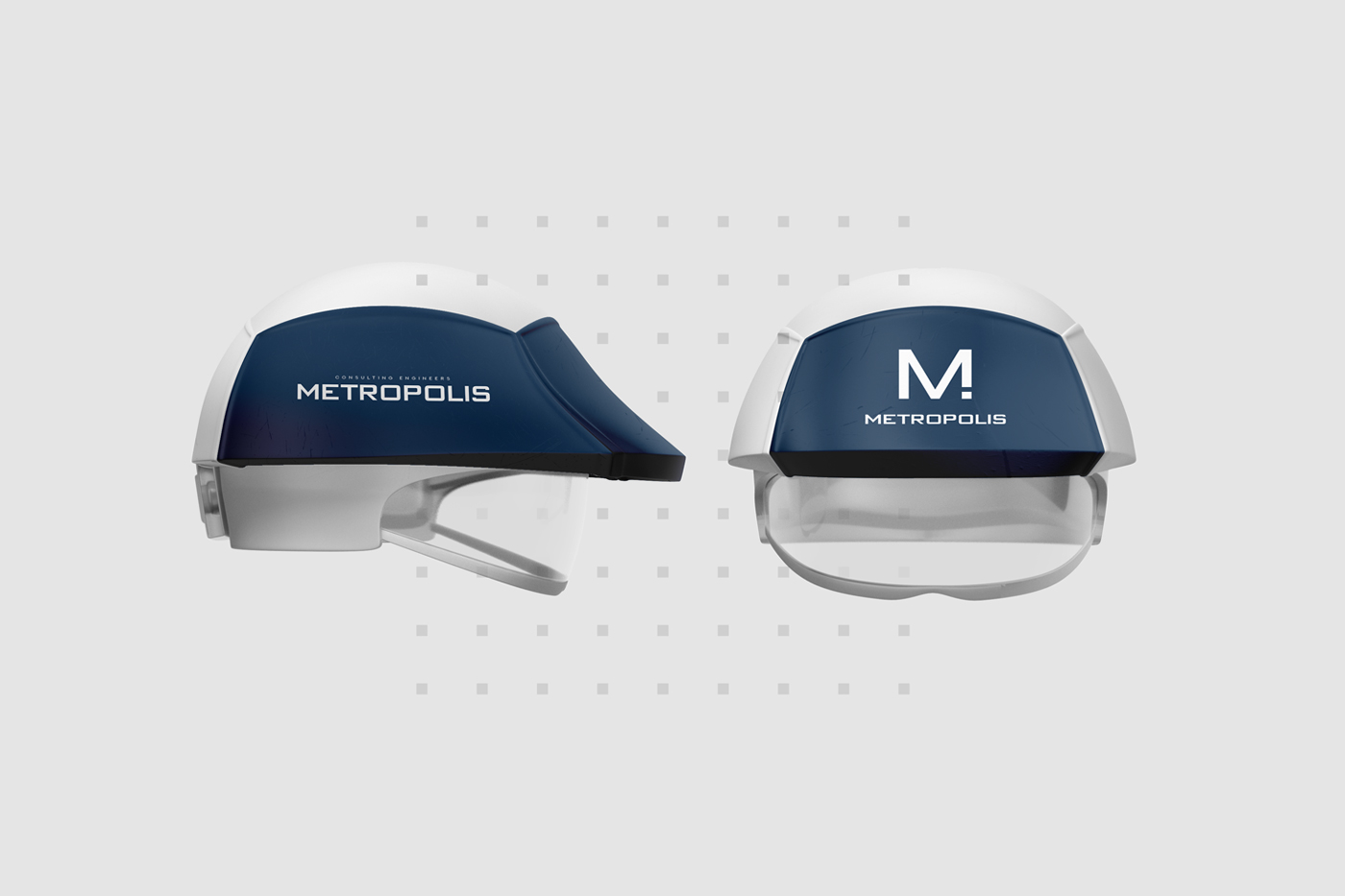
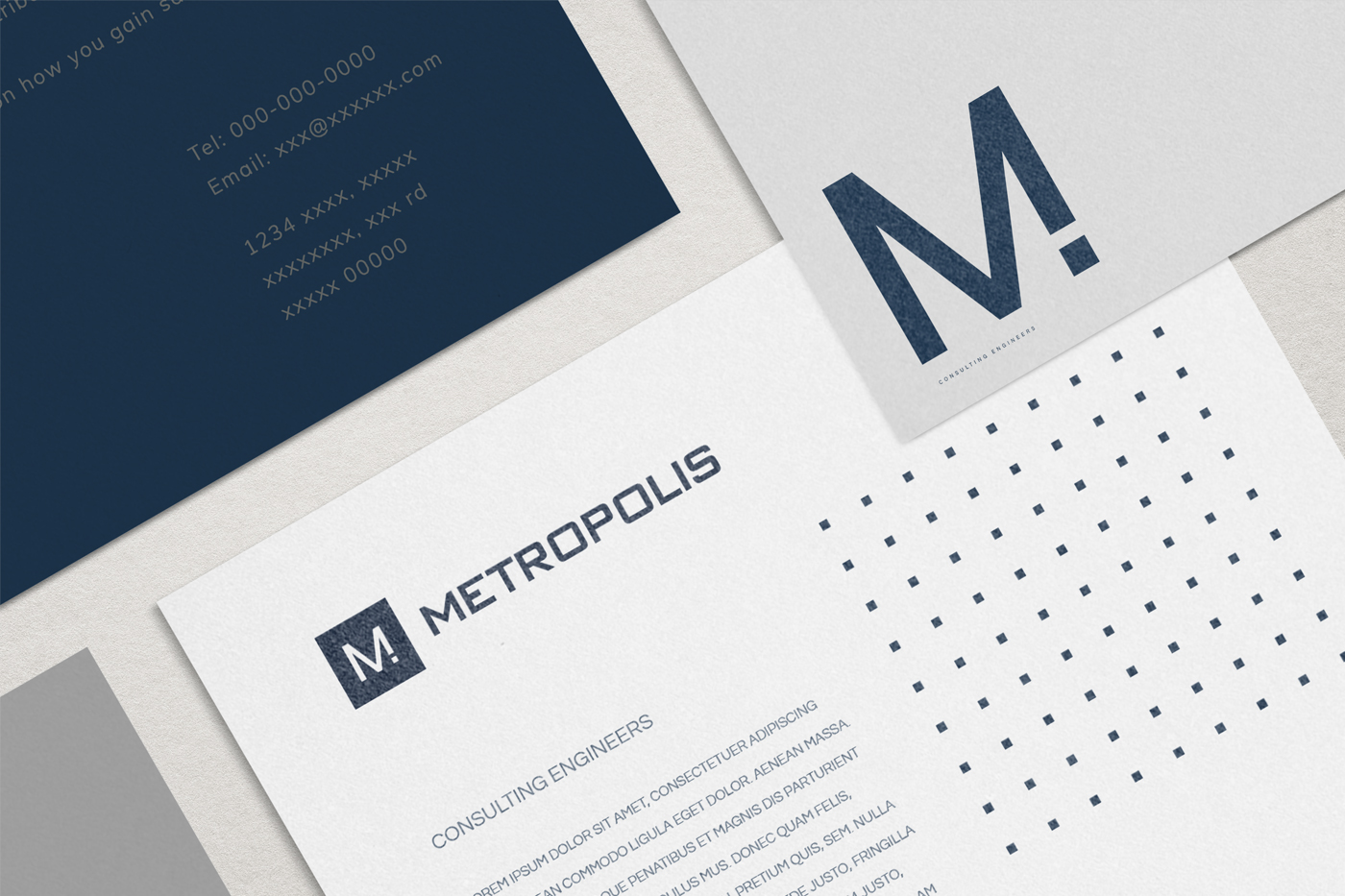
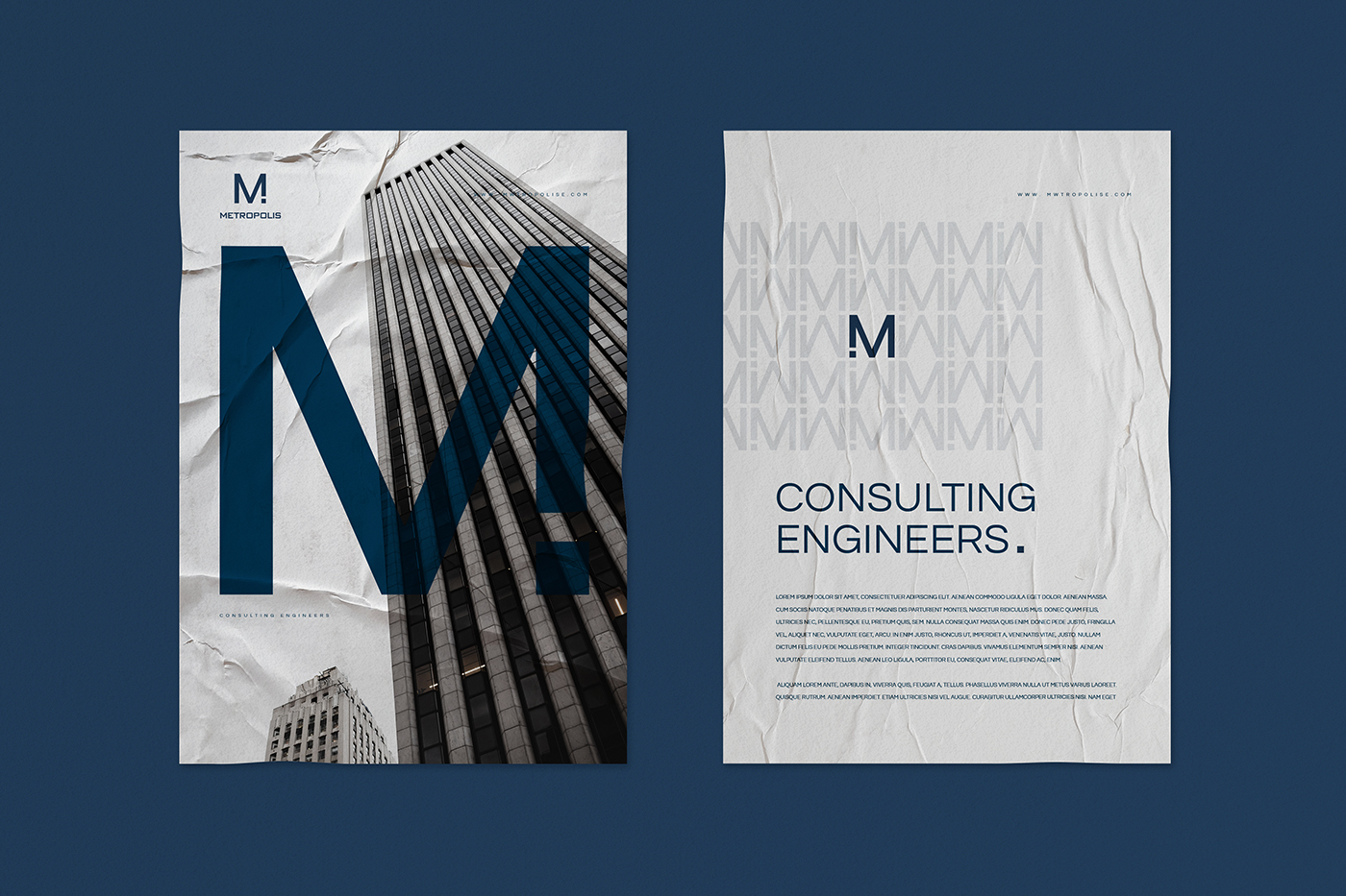
Approach: Crafted a sleek and minimalist logo featuring the letter M, symbolizing strength and precision in engineering. Designed a corporate identity with dark blue and gray colors to convey professionalism and reliability.
Result: A visually striking logo and corporate identity that reflect Metropolis Engineers’ commitment to excellence in building and engineering design. The strict, minimalist style exudes confidence and sophistication, setting the company apart in the industry.
Impact: Elevated brand recognition, increased client trust, and a distinct presence in the competitive engineering sector. The logo and corporate identity reinforce Metropolis Engineers’ reputation as a leader in innovative and reliable design solutions.
Conclusion: Successfully established Metropolis Engineers’ brand identity with a sleek and minimalist logo and corporate identity, signaling strength, precision, and reliability in building and engineering design.