YoDo Cosmetics Brand
Date: Sept. 2023
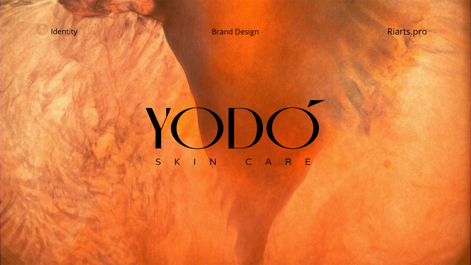
Case Study: YoDo Cosmetics – Elevating Elegance.
Challenge: Develop a typographic packaging logo and brand identity for YoDo, an iodine-based cosmetics brand, aligning with its premium essence.
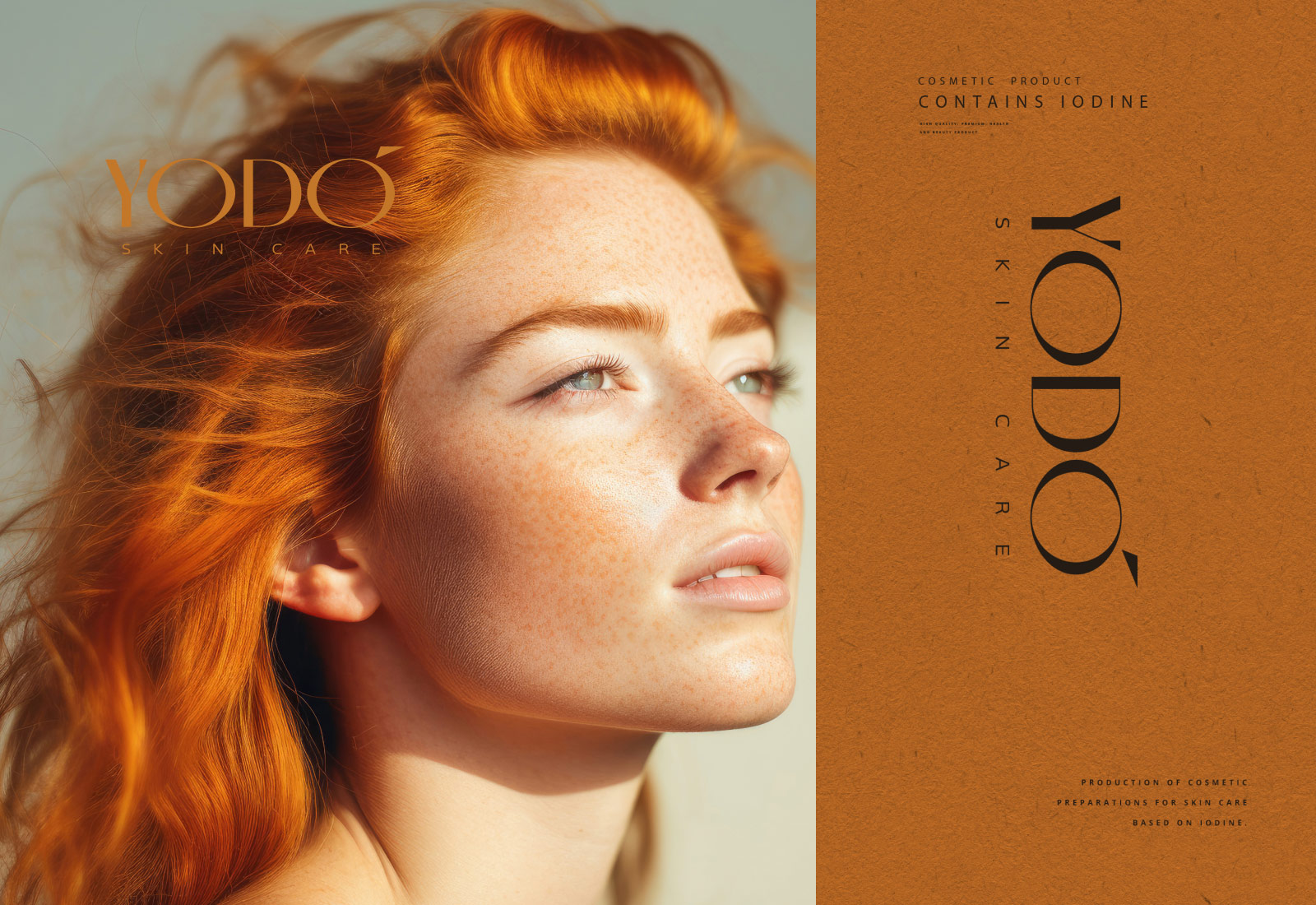
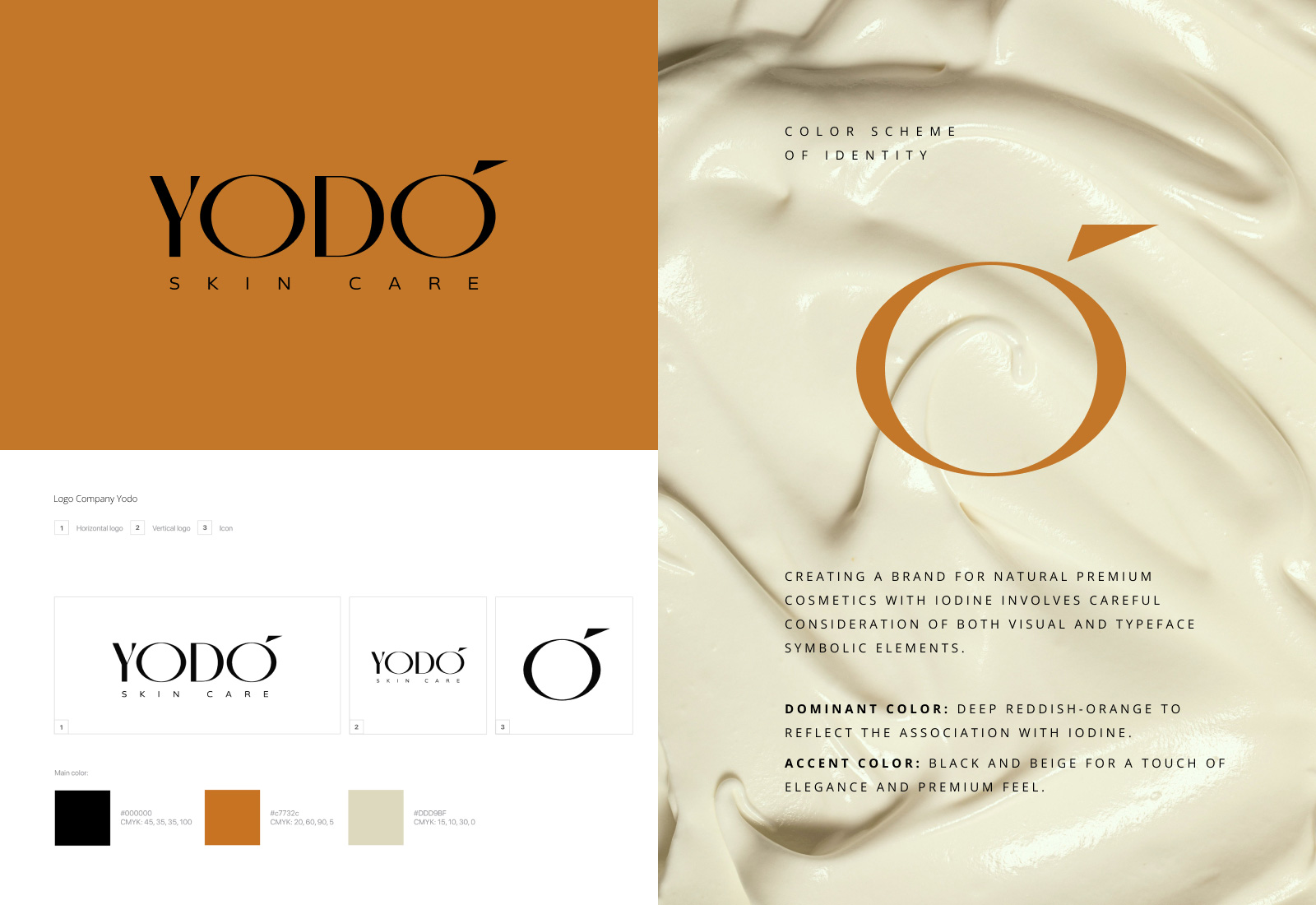
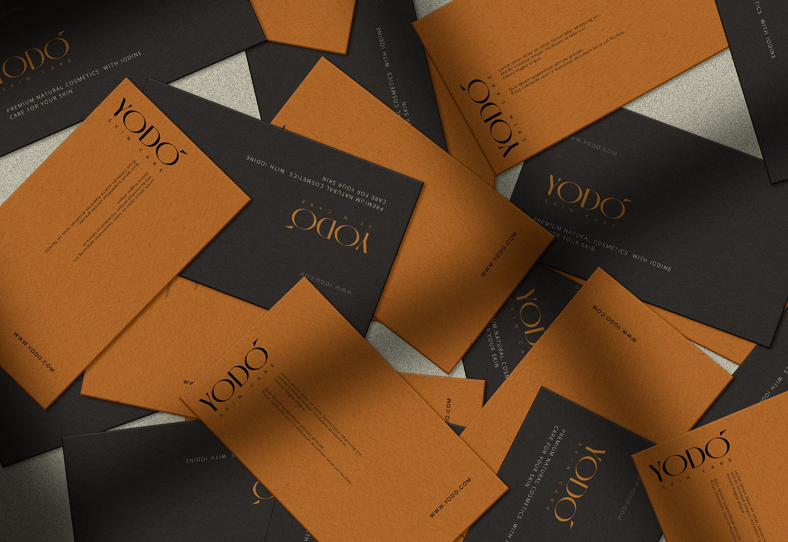
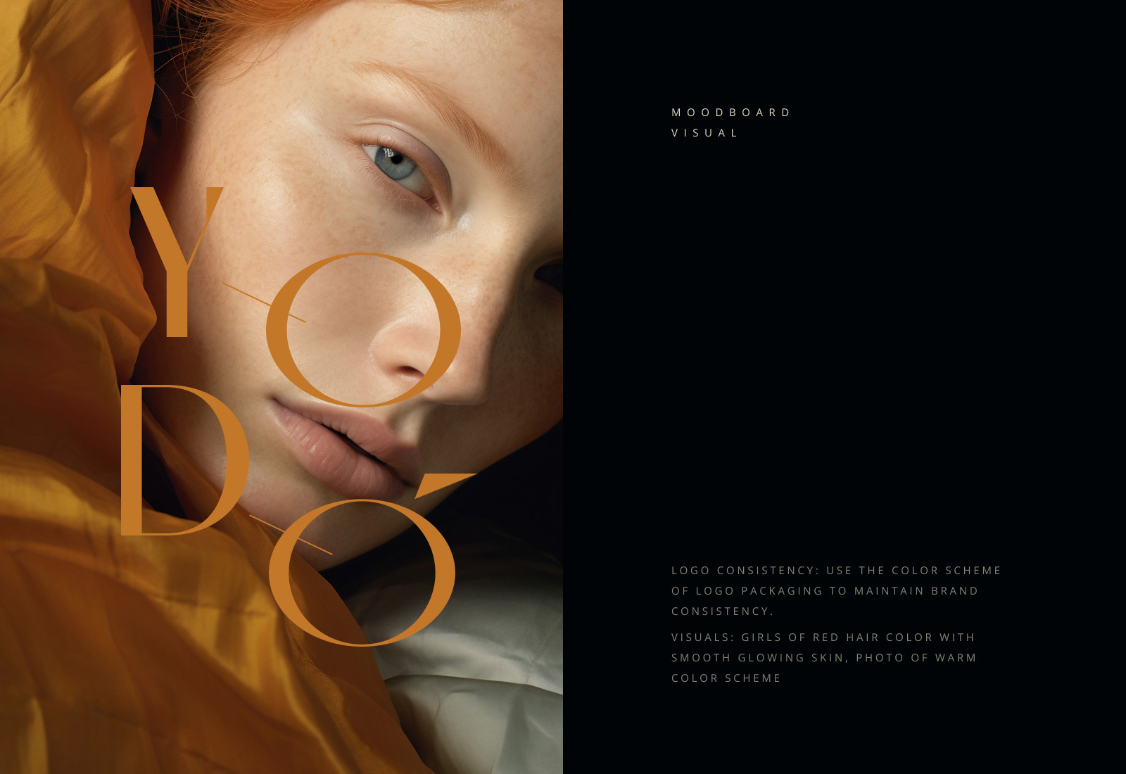
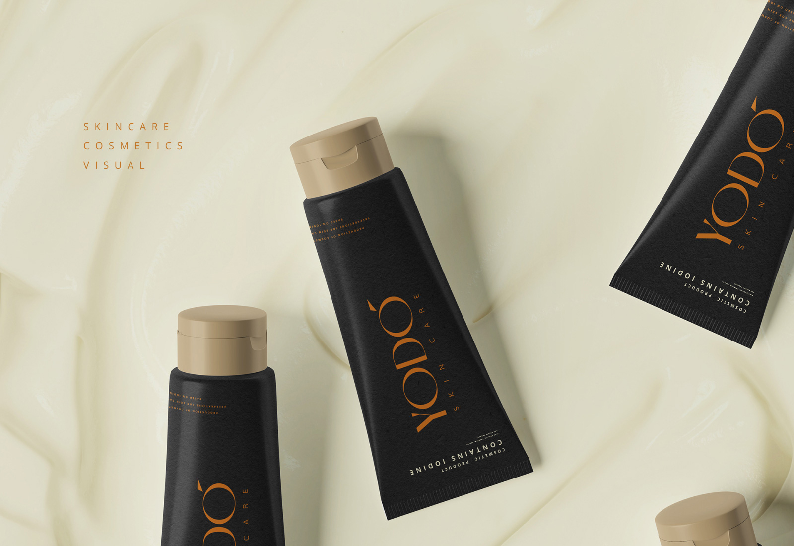
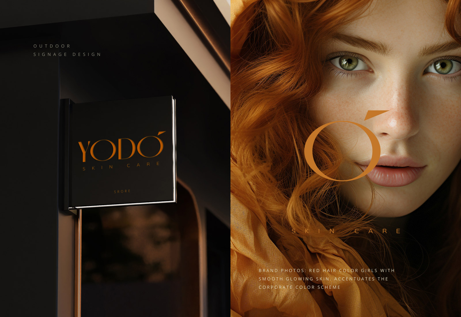
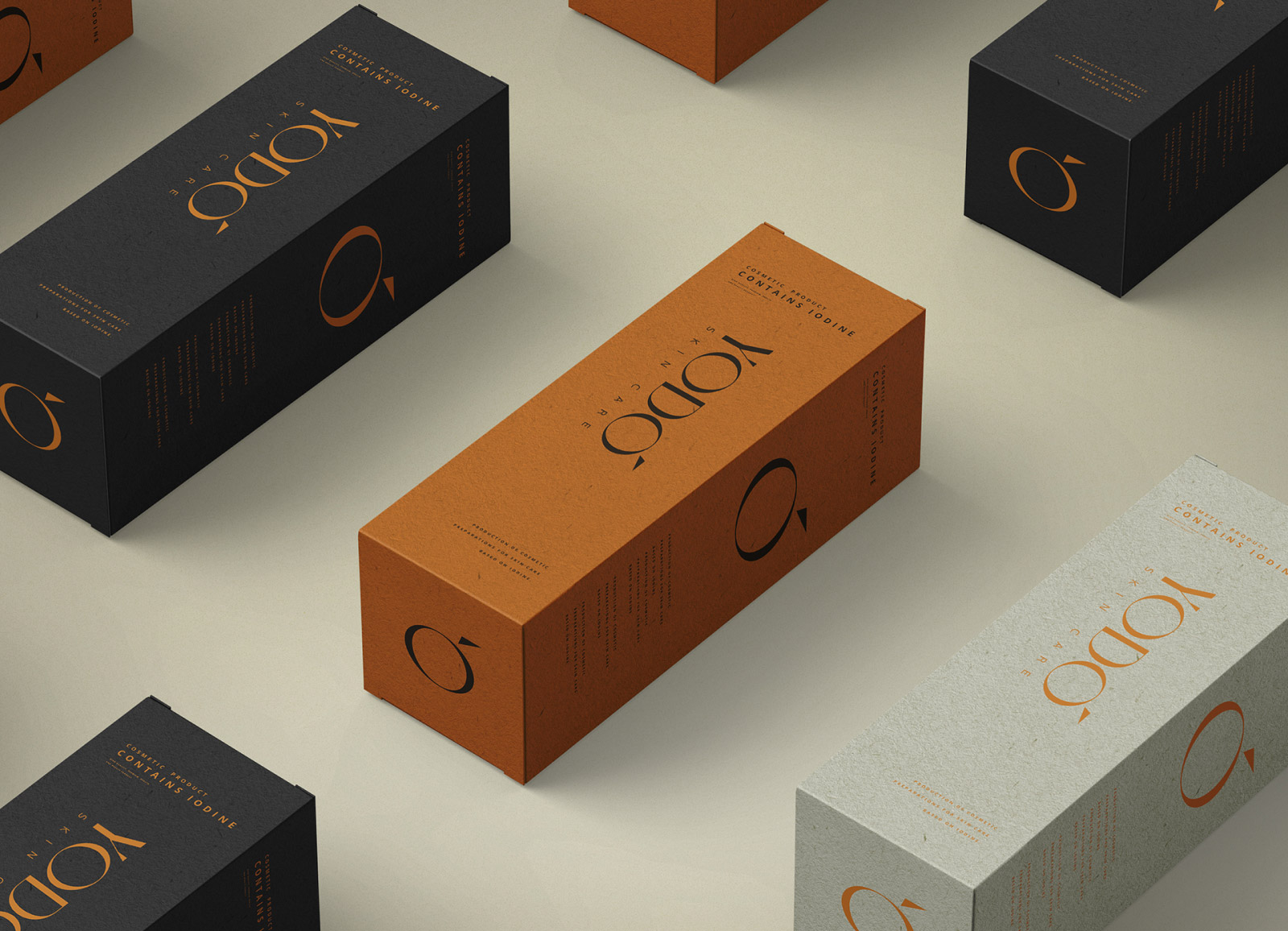
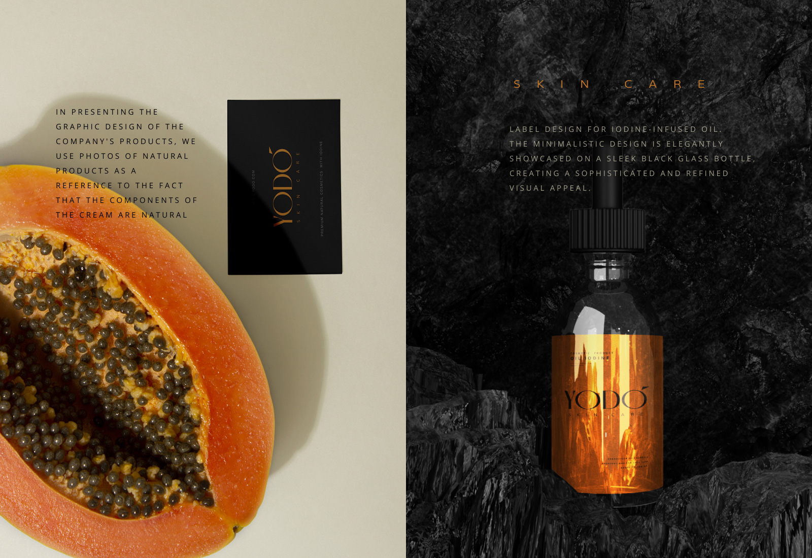
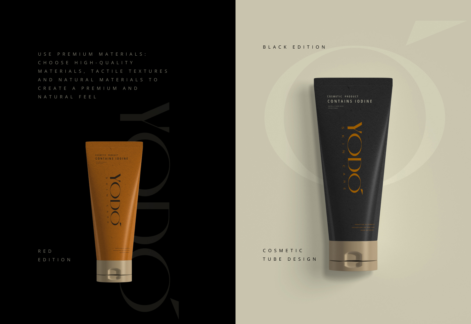
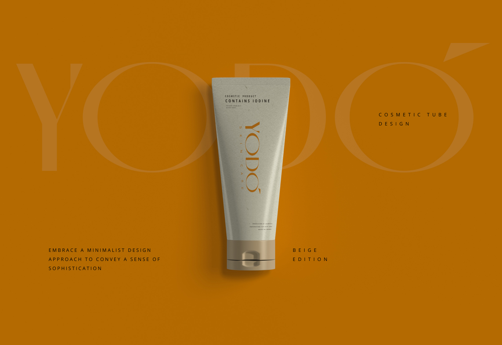
Approach: Crafted a sophisticated typographic logo, blending “Yo” with “Do” to evoke the brand’s core message of empowerment. Terracotta and black hues exude luxury. Featuring a redheaded girl reinforces brand identity.
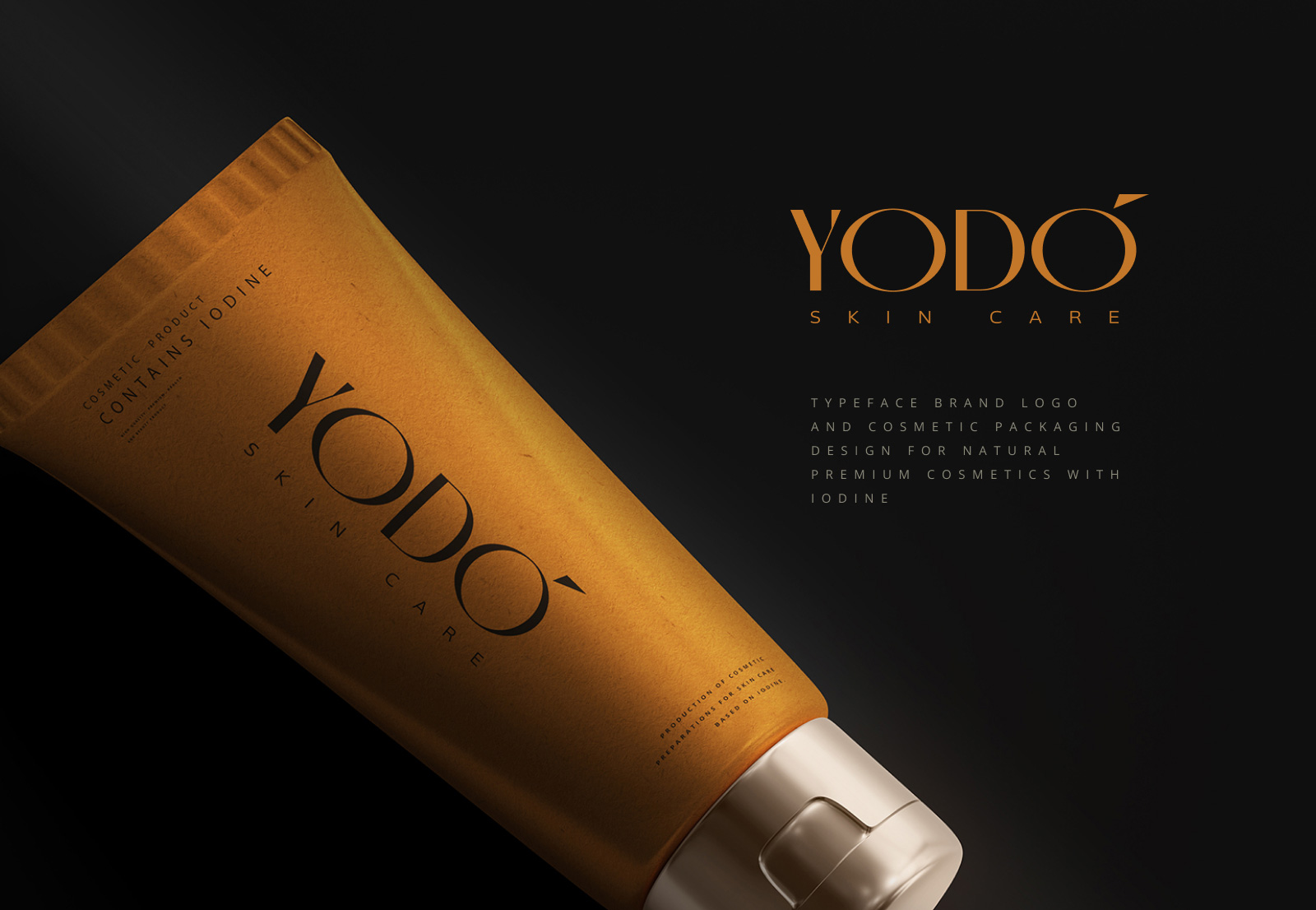
Result: A timeless and elegant brand identity that epitomizes YoDo’s premium offerings, resonating with discerning consumers.
Impact: Enhanced brand perception, increased product desirability, and strengthened market positioning in the cosmetics industry.
Conclusion: Successfully curated a typographic logo and brand identity that embodies sophistication and empowers consumers to embrace their beauty rituals with YoDo.