Yoki Yogurts
Date: Jule 2024
Case Study: Yoki – Crafting Flavorful Identity in Food.
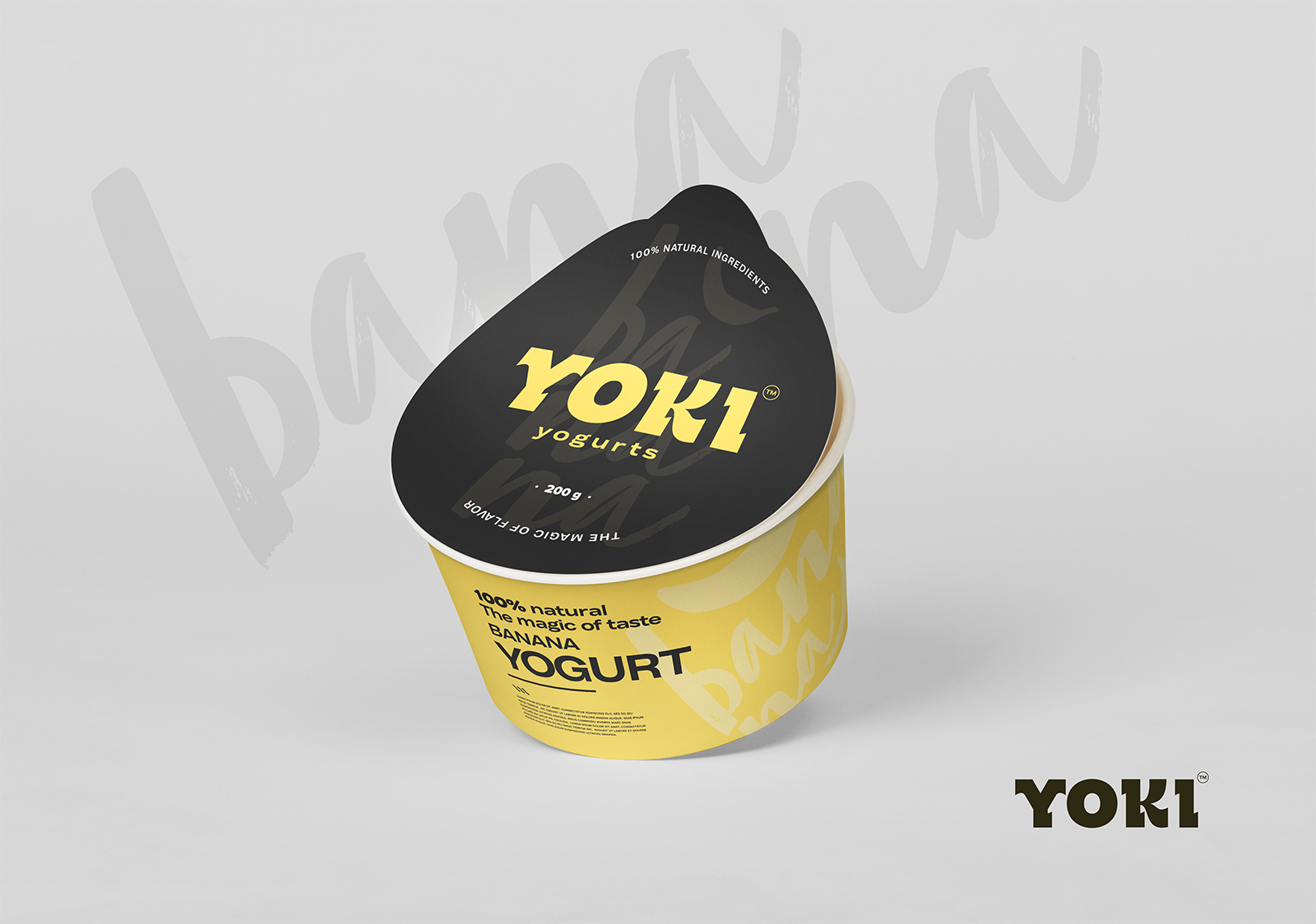
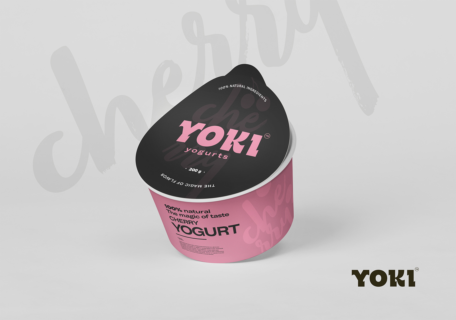
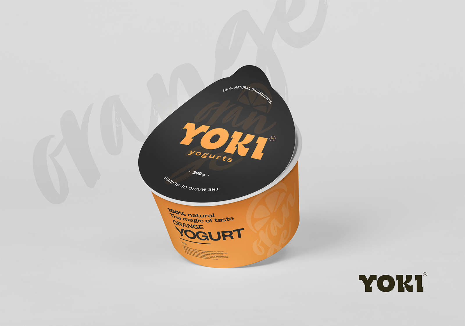
Challenge: Establish a typographic brand identity for Yoki, a food manufacturer, and design packaging for their line of yogurt flavors. Utilize a palette of Banana yellow and black to create a minimalistic and modern aesthetic.
Approach: Developed a typographic brand for Yoki that reflects simplicity and freshness. Created packaging for yogurt flavors with minimalistic design and illustrations of fruits to visually distinguish the flavors, enhancing consumer experience.
Result: A visually appealing brand identity and packaging design that embody Yoki’s commitment to quality and flavor. The use of Banana yellow and black creates a modern and distinct aesthetic, while the illustrations of fruits add a touch of freshness and vibrancy.
Impact: Increased brand recognition, heightened shelf appeal, and a distinct presence in the competitive food market. The typographic brand and packaging design reinforce Yoki’s reputation as a provider of delicious and visually appealing products.
Conclusion: Successfully established Yoki’s typographic brand identity and designed packaging for their yogurt flavors, setting a new standard for simplicity, freshness, and modernity in the food industry.