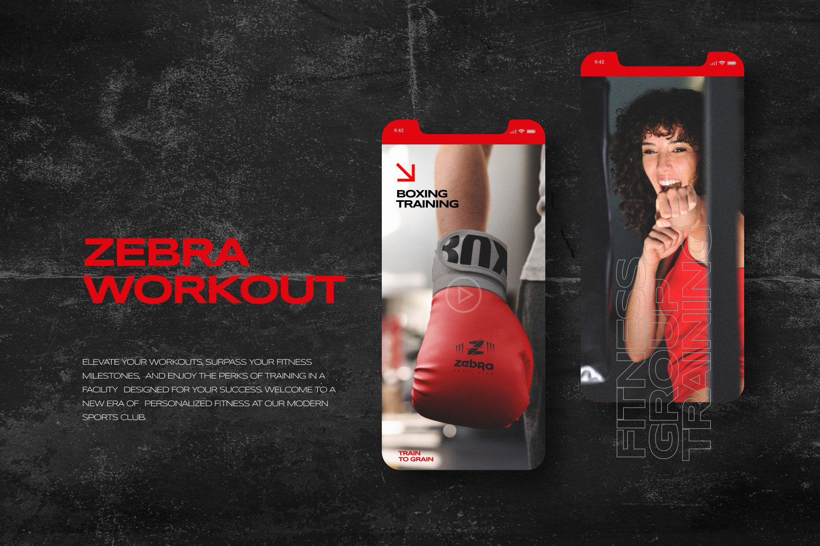
Zebra Sport Club
Date: Jun. 2019
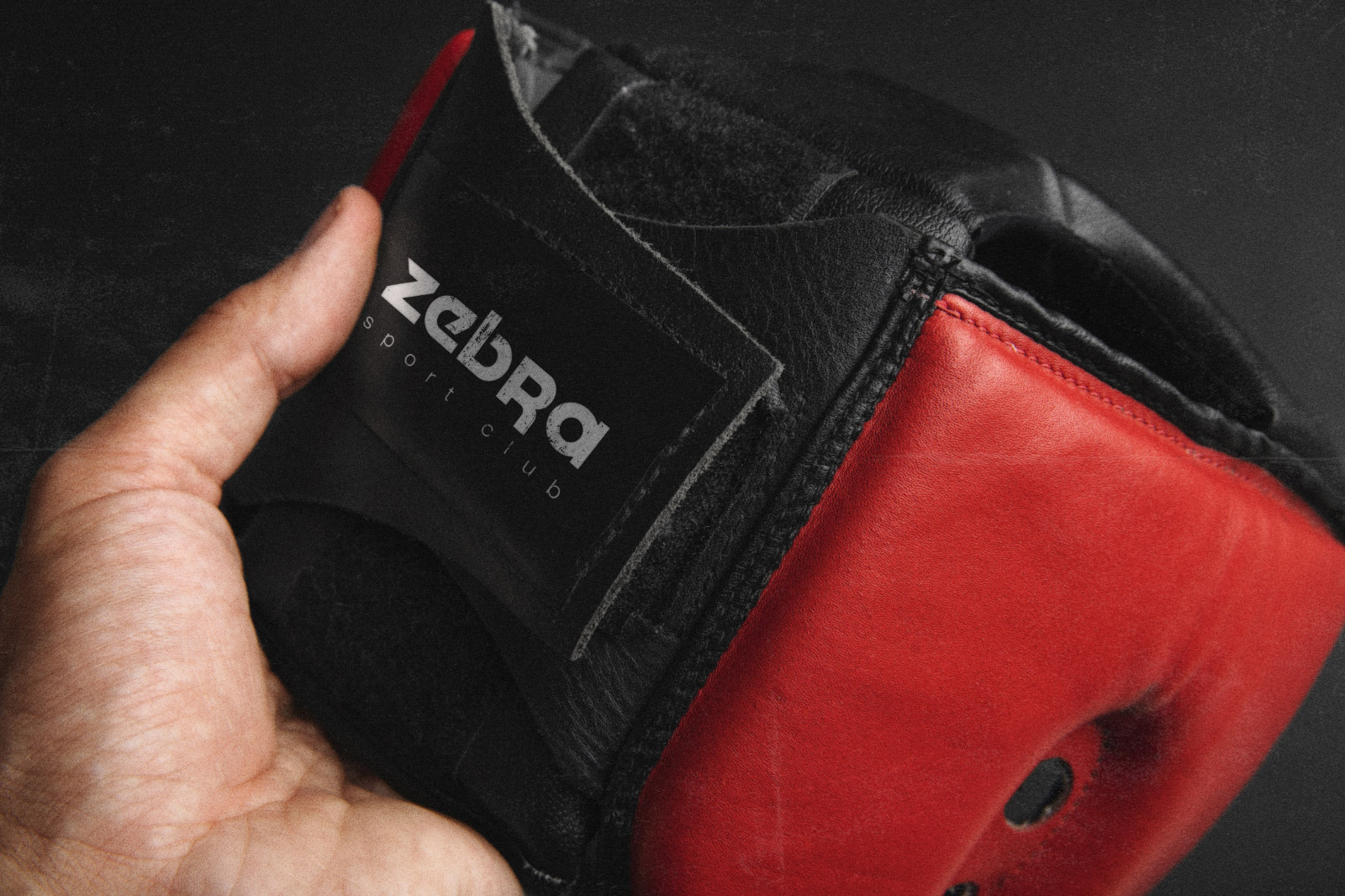
Case Study: Zebra Sports Club Roars to Life.
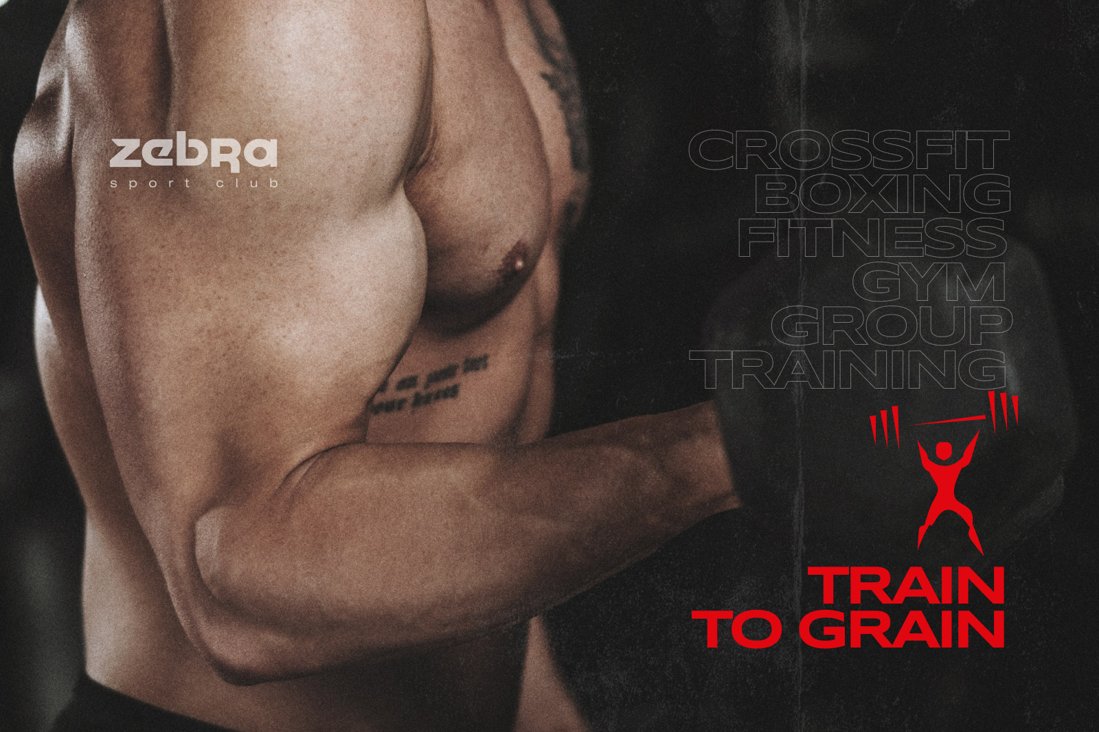
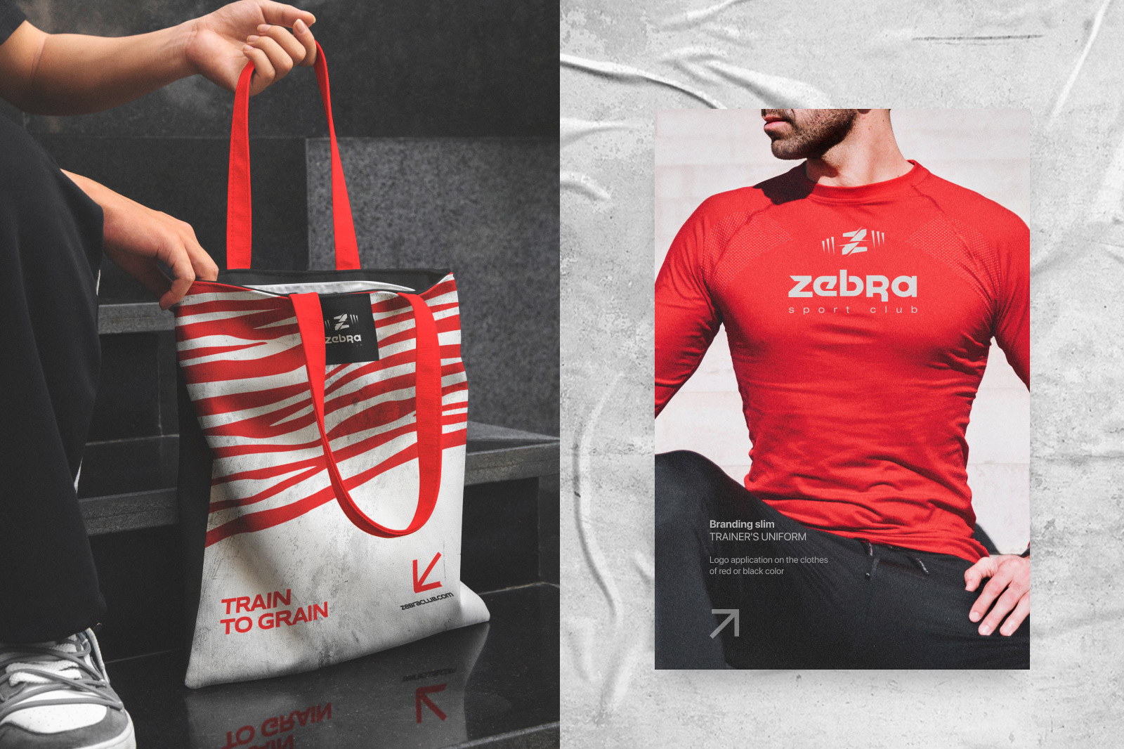
Challenge: Infuse the brutal charm of loft style into Zebra Sports Club’s identity. Create a logo and corporate design reflecting strength and grit.
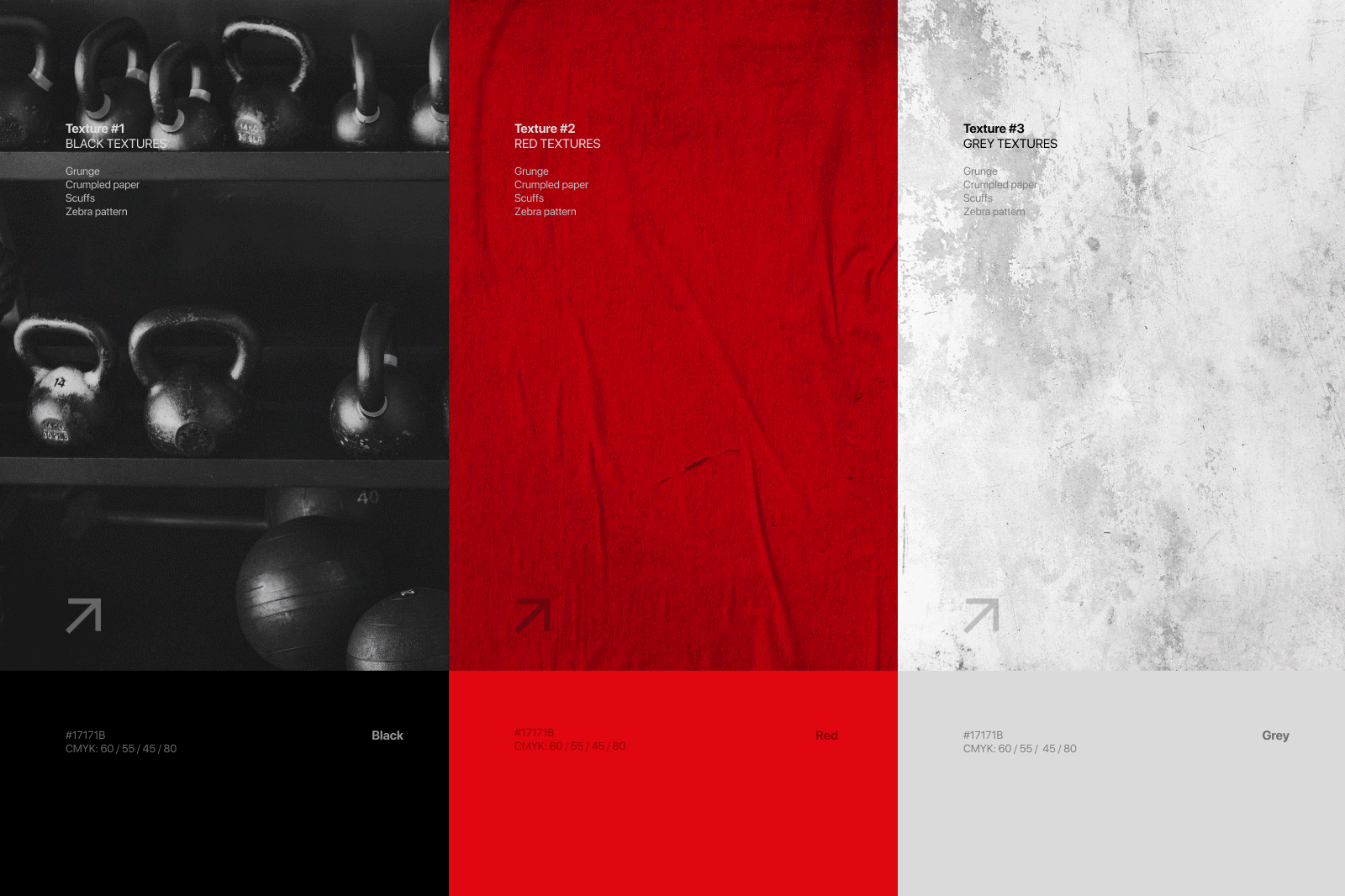
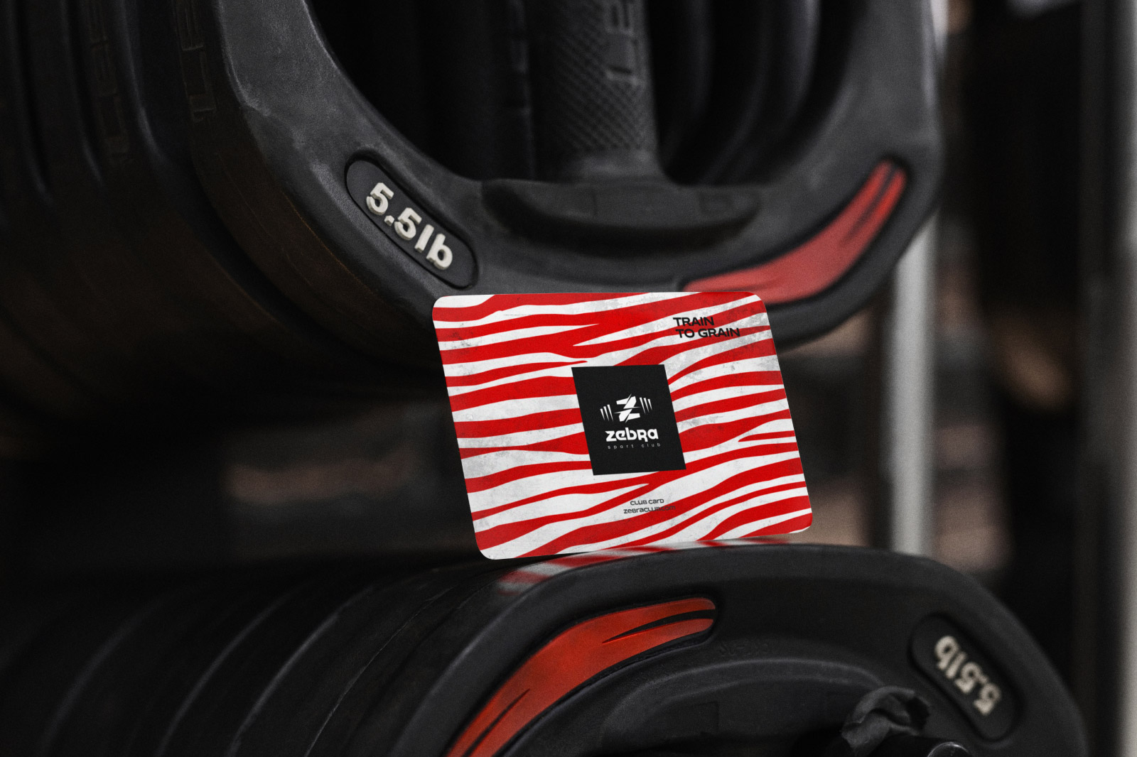
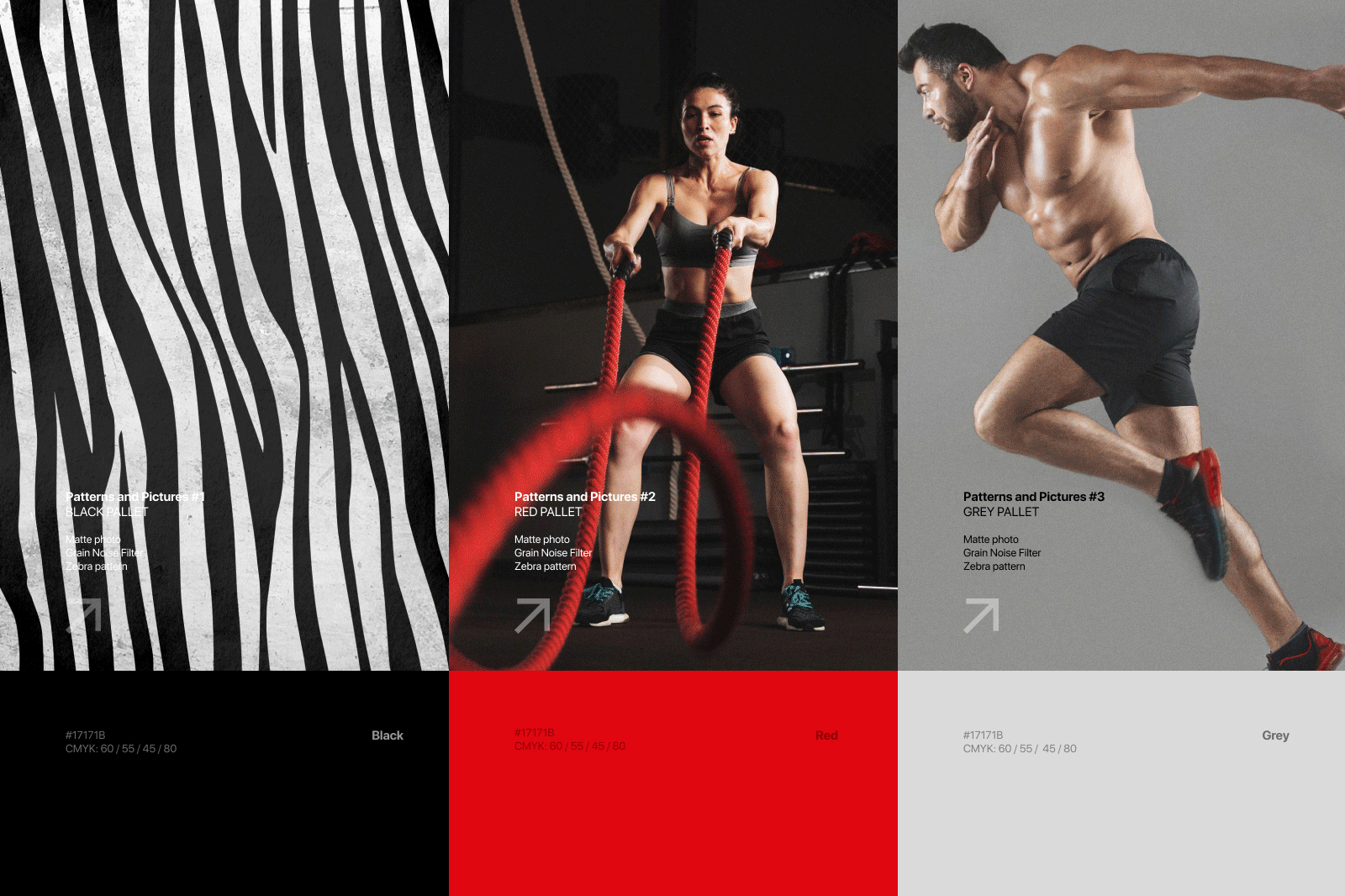
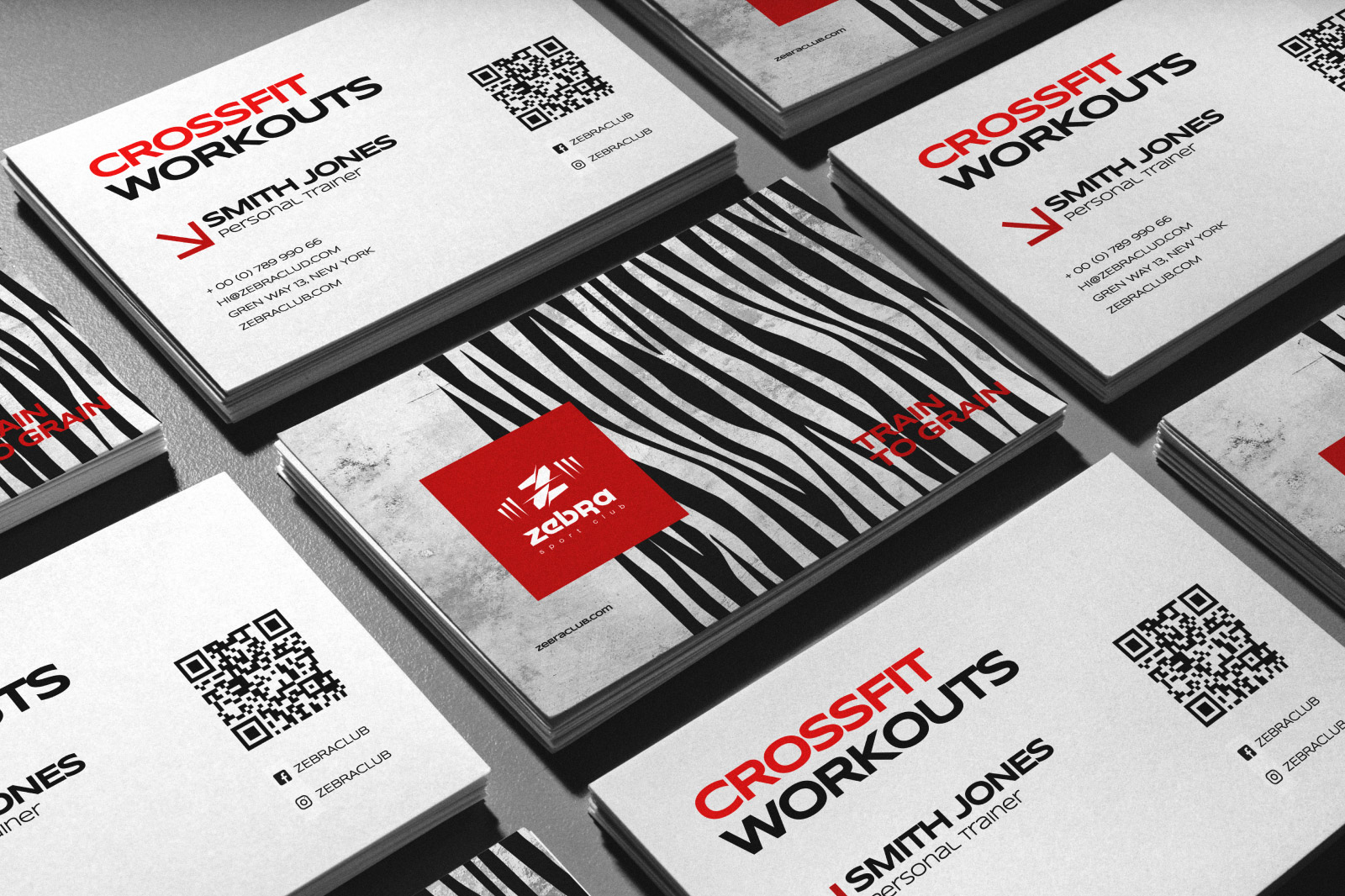
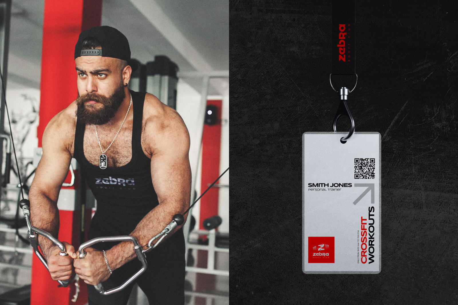
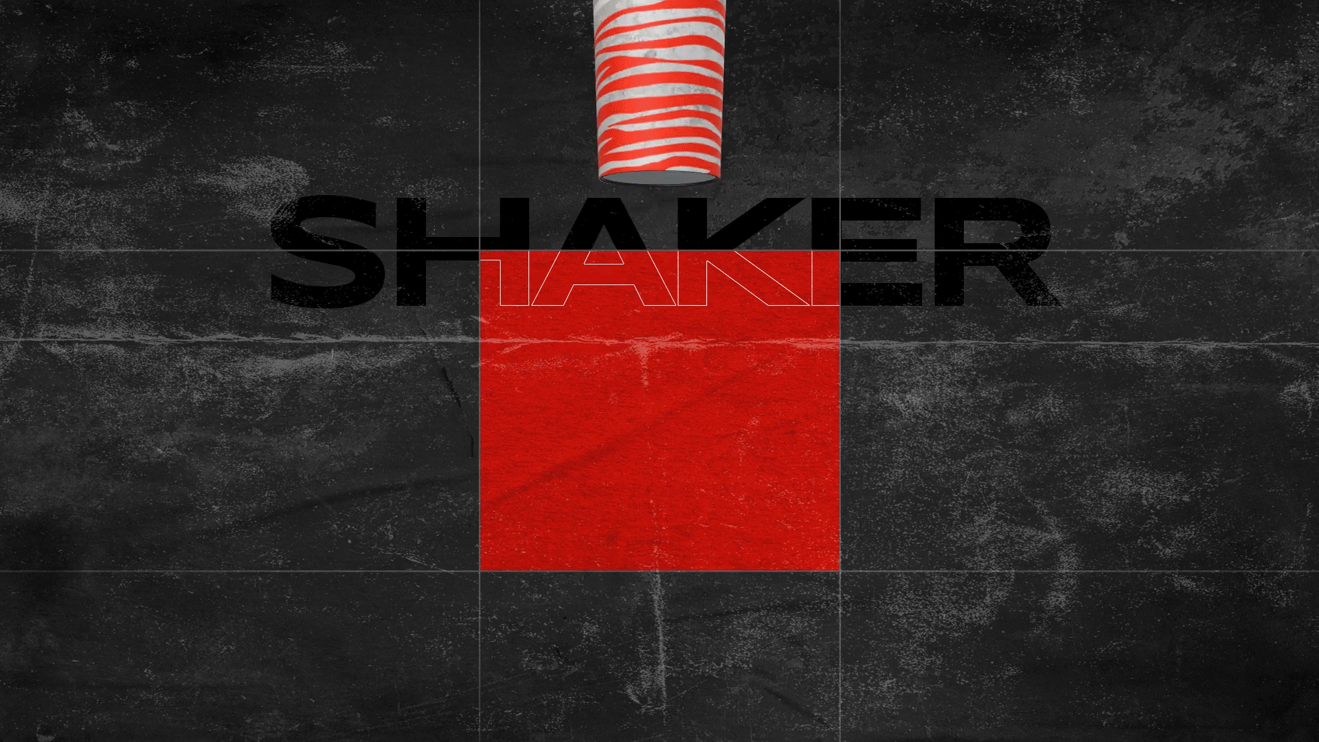
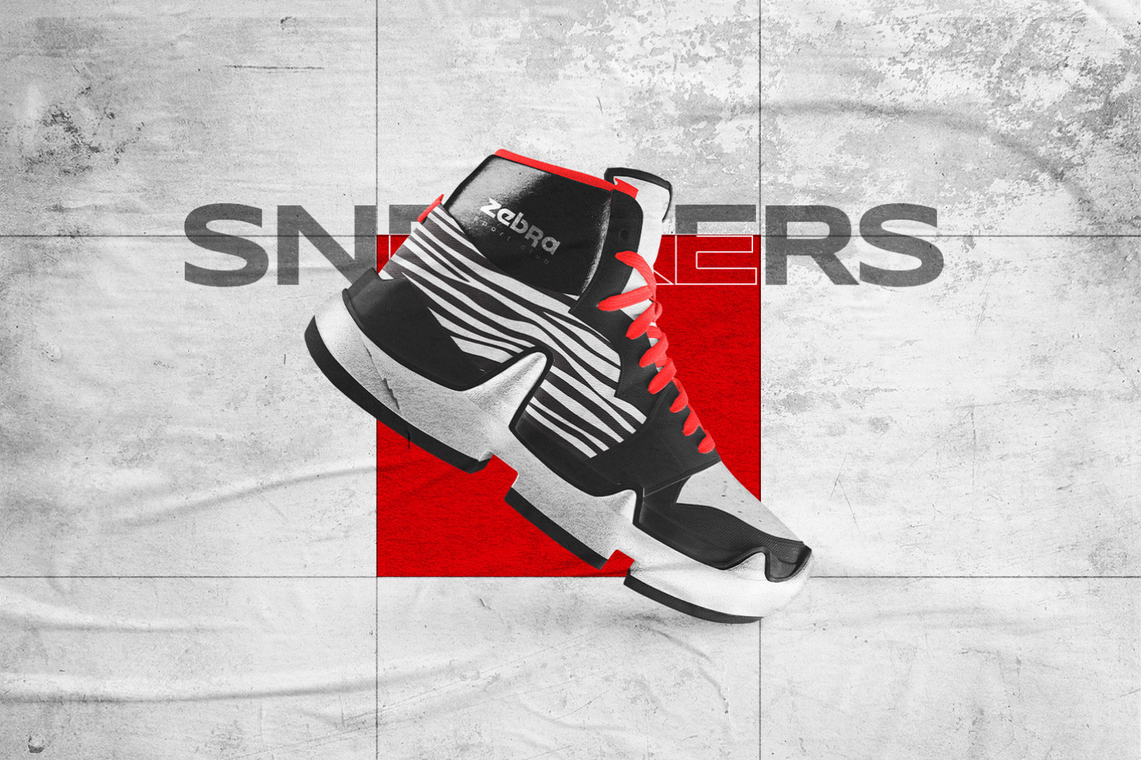
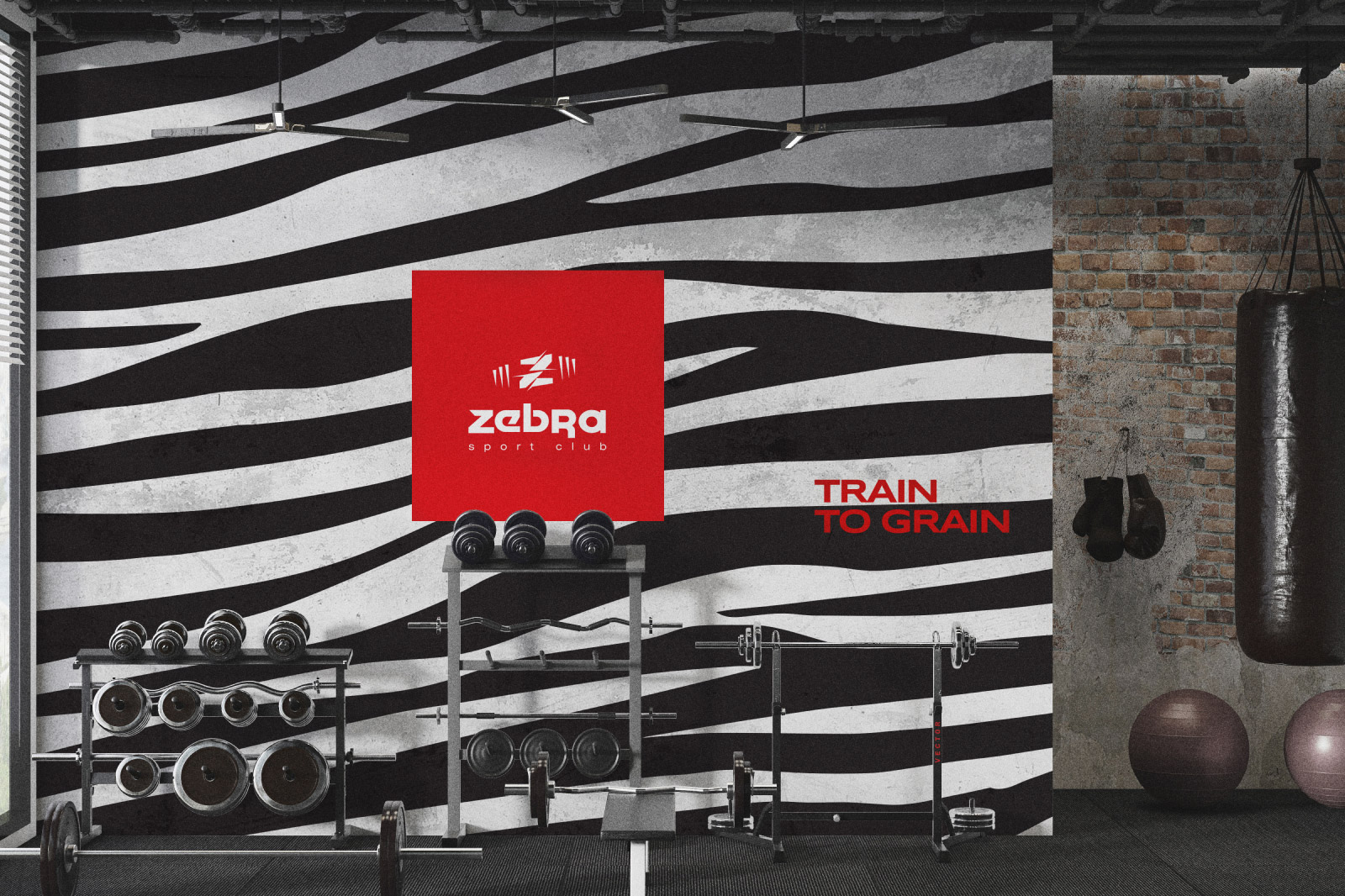
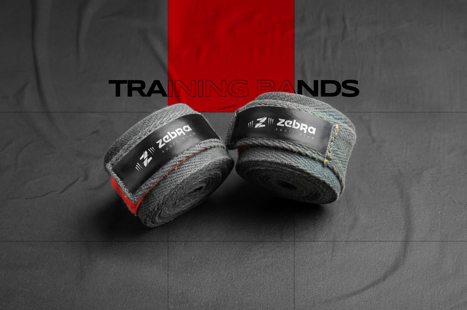
Approach: Embraced black, red, and gray, accentuating the fierce zebra pattern. Incorporated scuffs, crumpled paper, and grunge for a raw loft vibe. The logo, featuring the letter Z intertwined with a barbell, symbolizes strength.
Result: A visually dynamic corporate design exuding the rugged aesthetic of the sports club, engaging the audience with its unapologetic style.
Impact: Elevated brand visibility, increased membership, and a unique identity in the competitive fitness market. The design resonates with the club’s gritty and bold atmosphere.
Conclusion: Successfully transformed Zebra Sports Club into a symbol of raw strength and loft-inspired energy.